WE OPEN SPACES is a friendly society which was founded by Sebastian Sadnek, Carina Radl and myself. The purpose of the association is to provide open space for discussions in an enjoyable atmosphere.
Collaboration
We got to know each other during a coaching of the Austrian creative industries in Carinthia. Within this coaching, we had to create and realize a project in cooperation. We three decided to organize a Barcamp called reACTcamp 2019. Therefore we decided to found an association. We had some time pressure and we needed a fast but also powerful branding. Therefore we collected some ideas and decided together which one fits the best. We decided to go with a simple 3D-block based logo that is variable and easy to adapt for different purposes. The primary font is RIFT Soft Bold and the secondary font is Letter Gothic Std, that is especially used for print and other things. Also, the color palette was decided by a voting process. The dark blue/purple and the neon yellow are the main colors of WOS (We Open Spaces). The other colors are intended for the different Barcamps – green for the reACTcamp, purple for the urbancamp and the grey/brown for the barncamp.
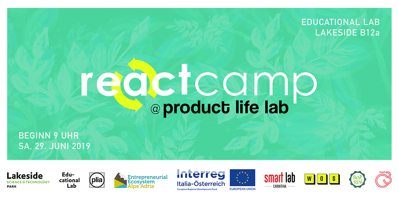
For the reACTcamp 2019 I designed a banner graphic for different purposes like Eventbrite, Facebook and so on. The reACTcamp logo is made by Carina Radl.
Labeling — reACTcamp 2019
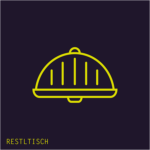
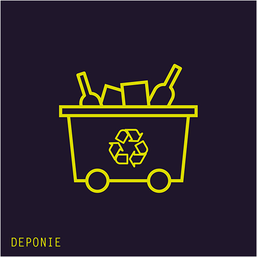
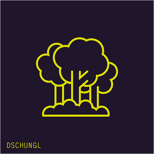
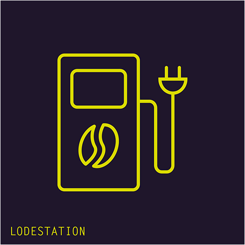
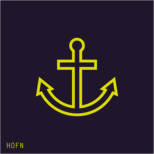
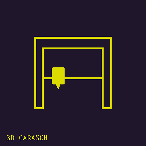
To ensure, that everybody can easily find the session spots during our Barcamp, I created a labeling for each spot. The symbols represented also the decoration of the spots.
Do you also have ideas or projects you want to realize?
☞ Let’s have a talk.