Stagebackers
Brand Identity & Print
First of all, I have to explain, what Stagebackers is. It’s a crowdfunding platform for musicians and bands on which they can integrate their fans into the tour planning process. The goal of the platform is to define the cities of a tour with the commitment of the fans.
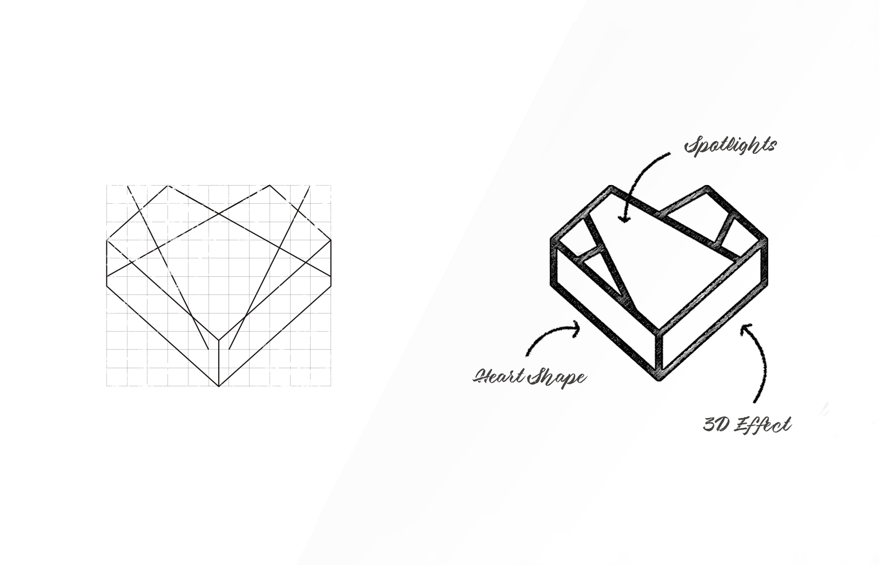
For that reason, I chose the name Stagebackers. The commitment of the fans makes it possible for the band to realize concerts during a tour that normally wouldn’t be an option. The symbol tries to illustrate this value. The three-dimensional heart stands for the stage that is created by the fans. The spotlights on the heart should make it clear that it’s a stage.
Fonts & Colors

Font Concept
In regard to the font, I needed something that can work for example on different music posters and don’t come into conflict with the styles of different music genres. After countless fonts, I found the font Cervo and adapted the letter A in the word STAGE. I also experimented with transparent and filled versions, but in the end, this version looks most consistent. For the general text and the web I used the font Montserrat. For headlines and messages I went for the font Pure Heart. It hast something insurgent and fits perfect to the goal of the platform.
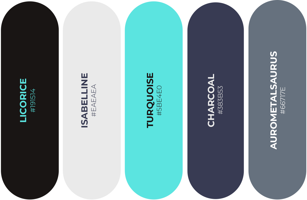
Color Concept
In regard to the font, I needed something that can work for example on different music posters and don’t come into conflict with the styles of different music genres. After countless fonts, I found the font Cervo and adapted the letter A in the word STAGE. I also experimented with transparent and filled versions, but in the end, this version looks most consistent. For the general text and the web I used the font Montserrat. For headlines and messages I went for the font Pure Heart. It hast something insurgent and fits perfect to the goal of the platform.
Prints & Co-Founder Campaign
The print design is based on concert pictures that transport the atmosphere and mood of a concert. The pictures get adapted with Charcoal overlay to fit the color concept. The design for the business cards was the first try to prove the concept.
To support the search for a co-founder I created a poster and flyer. These two print products should lead to a landing page with specific information about the project and the requirements.


Custom Icons
For the MVP (Minimum Valuable Product) or the prototype, it was necessary to design some custom icons. Even it shouldn’t be necessary to explain icons but I will do it just to be on the safe side. The first three icons represent the target groups musicians, fans and promoters. The other three icons stand for a wishlist, a crowdfunding campaign, and the organization.
You have a game-changing idea?
☞ Let’s have a talk.