derSchwarzmaler
Brand Identity & Print
Logo Creation
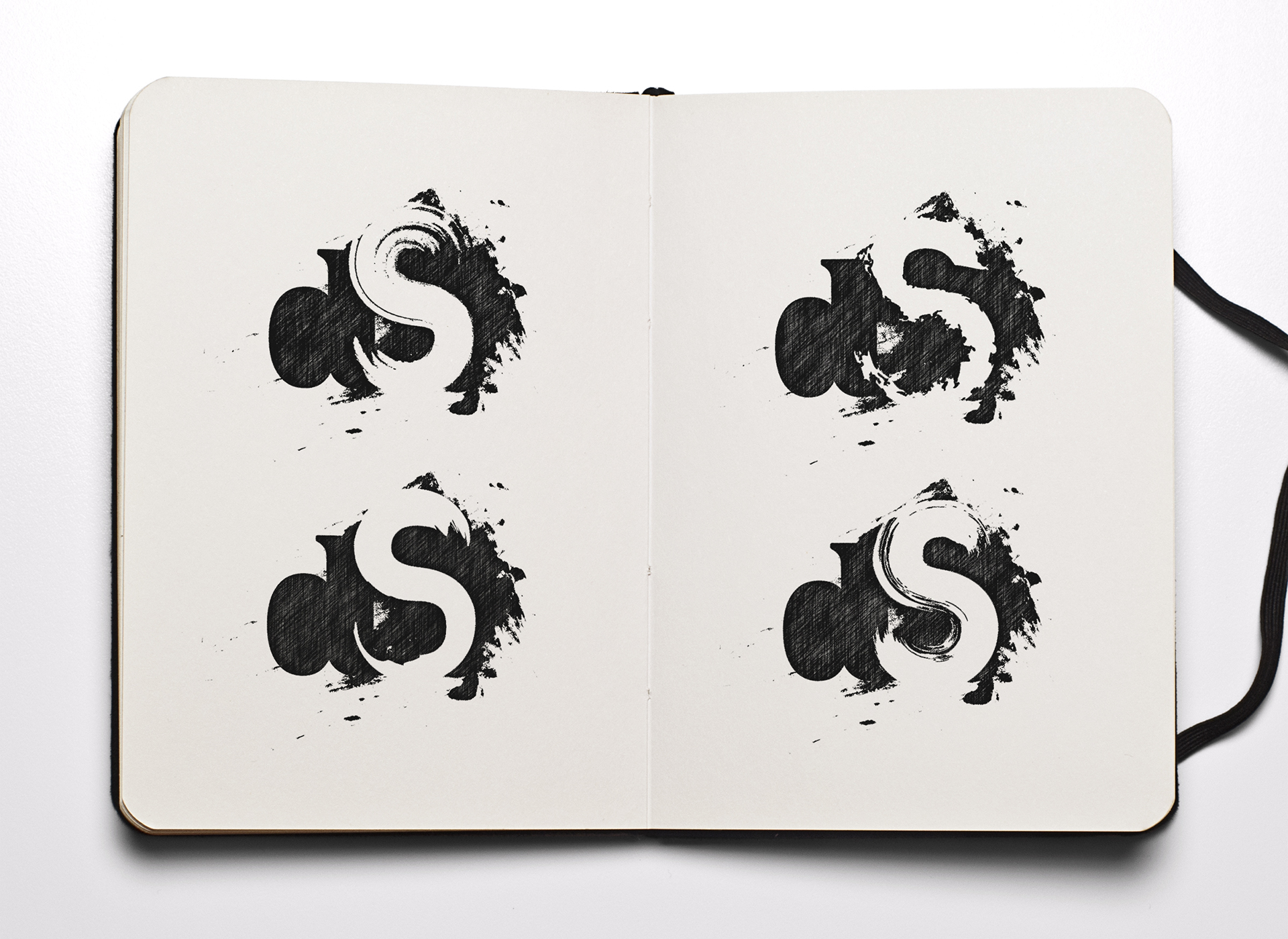
In the sketchbook, you can see the last iteration of the creation process. It was a long and intensive way to get to this point. Anyway, I wanted to create something classic as well as clean but also something rough and dirty. So I came up with a classy serif font for the letter d combined with a brush styled S that is shown in the negative space of a dab of paint. After some experimenting and finding inspiration on Pinterest, I decided to try a brush with several lines. This worked out pretty good and I was really happy with the final result.
Font & Name Concept
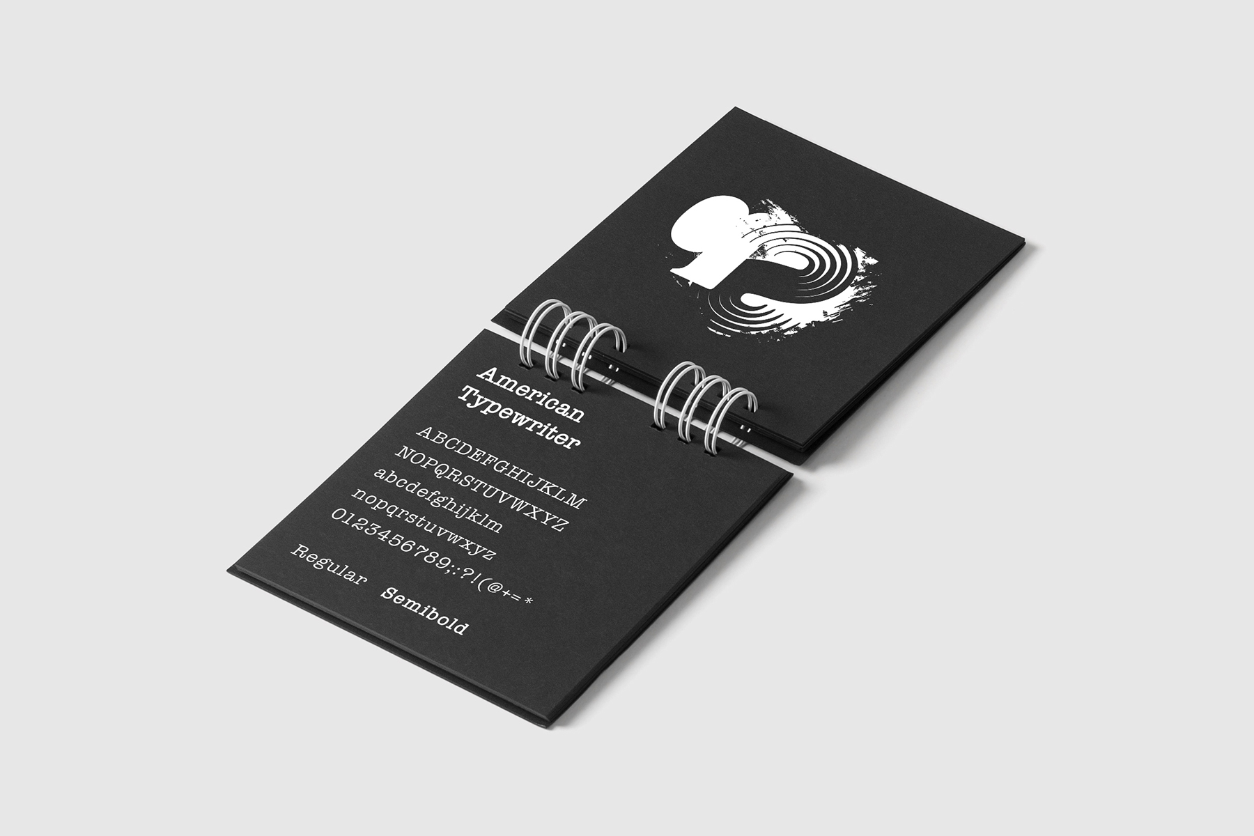
The Font American Typewriter is in my mind a good fit for the logo and also a consistent contrast to the other graphic elements and icons. The name is maybe a disadvantage because in German there are some negative associations contained in this word. For sure, it is meant to be understood sarcastically and not too serious. At first, this was designed for my personal brand but then I decided to go with JALASTAIR.
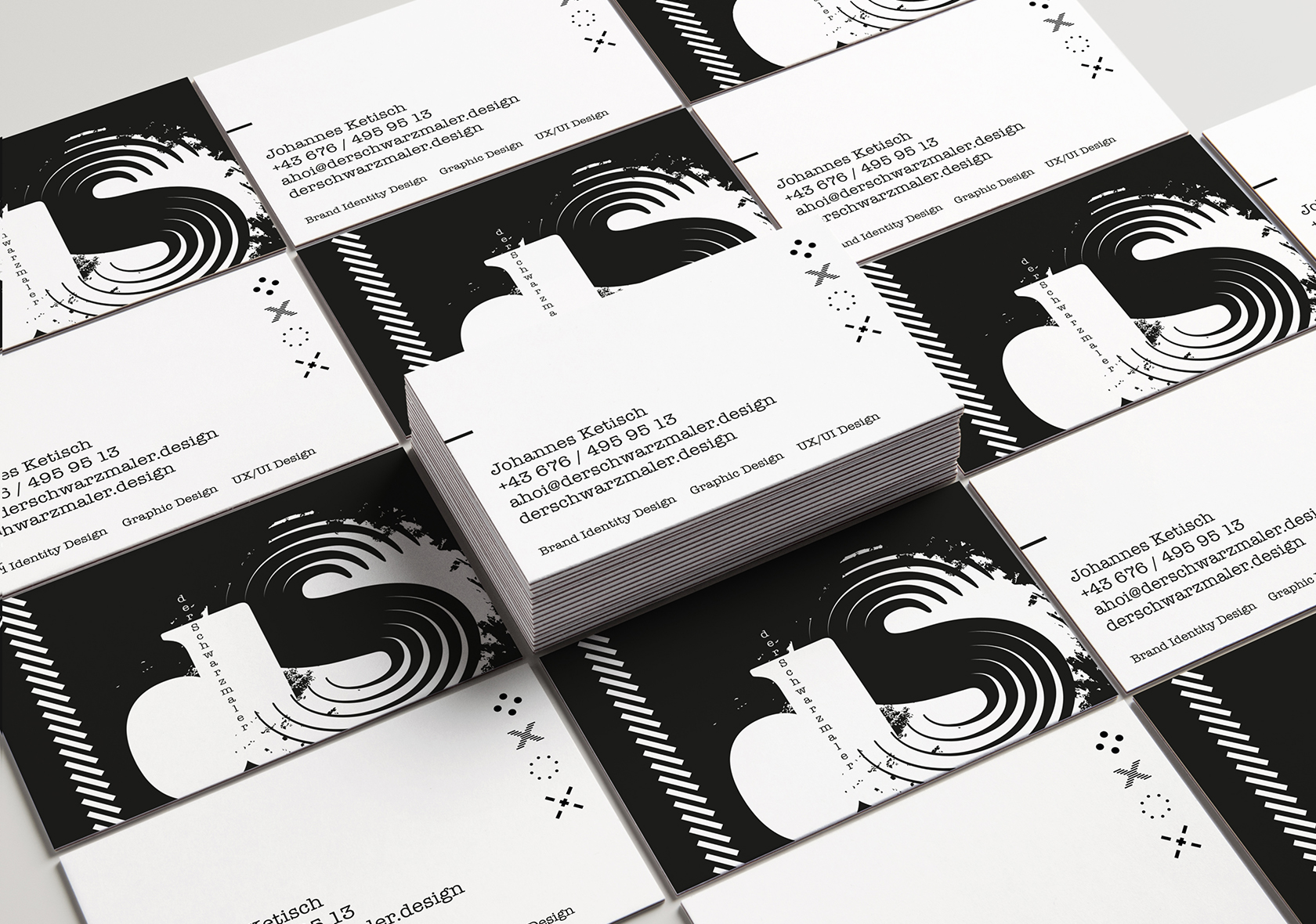
For some traditional networking and for swapping contact information, I created some business cards for derSchwarzmaler.
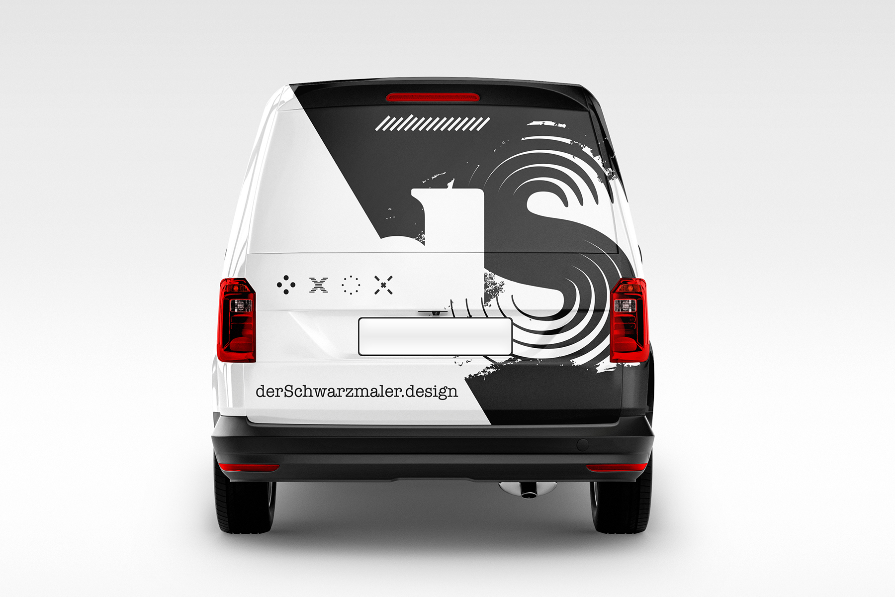
For experimental purposes I created a design for a car wrapping. On the car you can find almost all elements and symbols of the Identity.
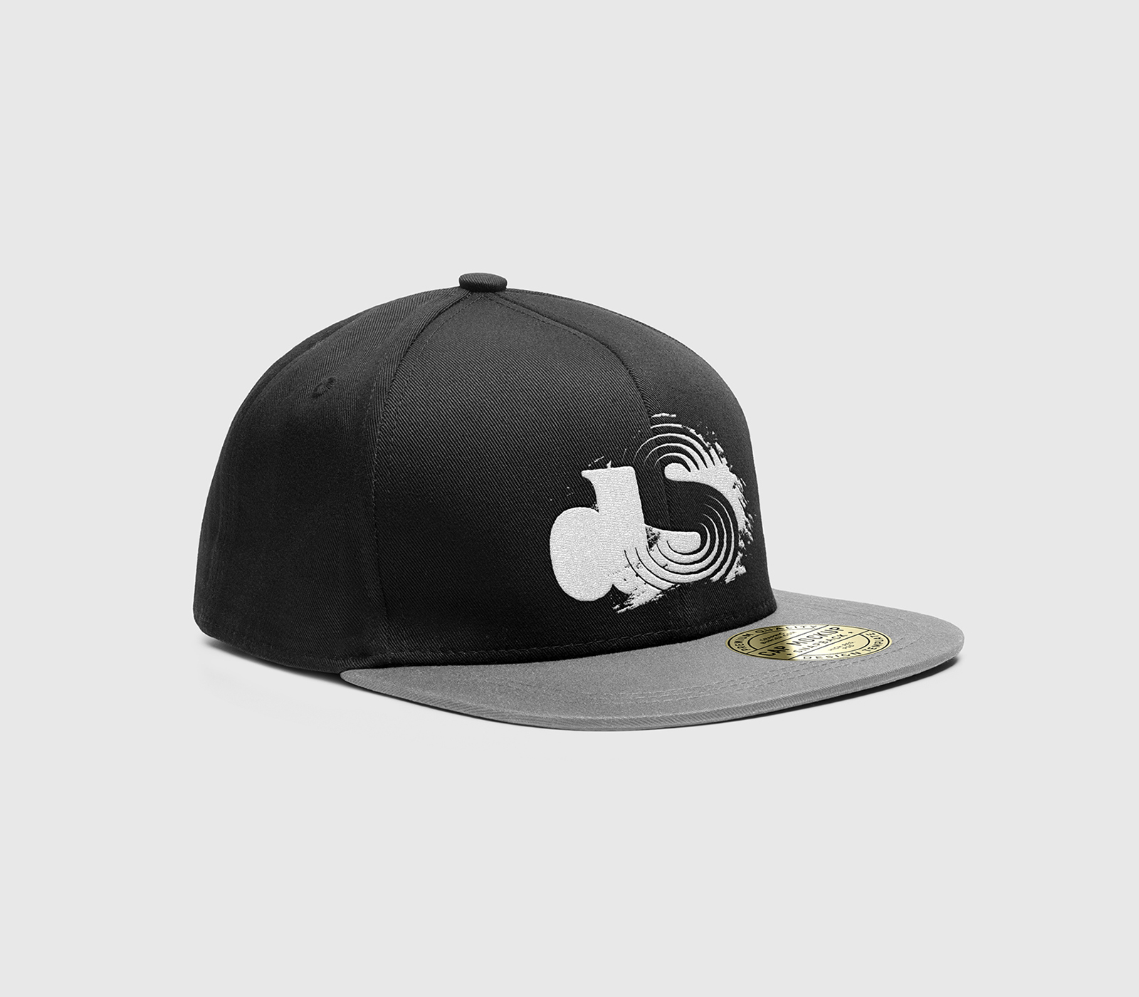
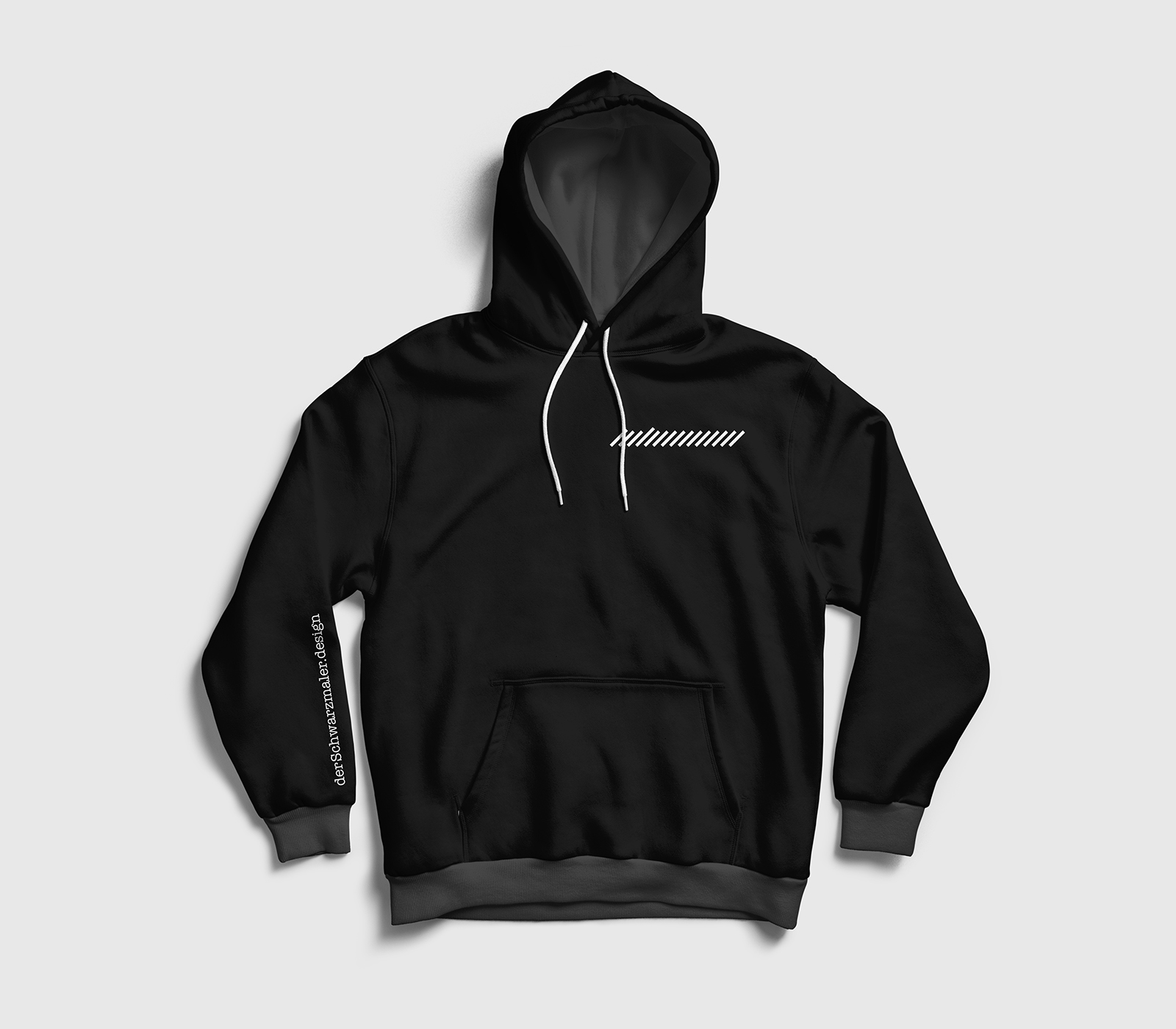
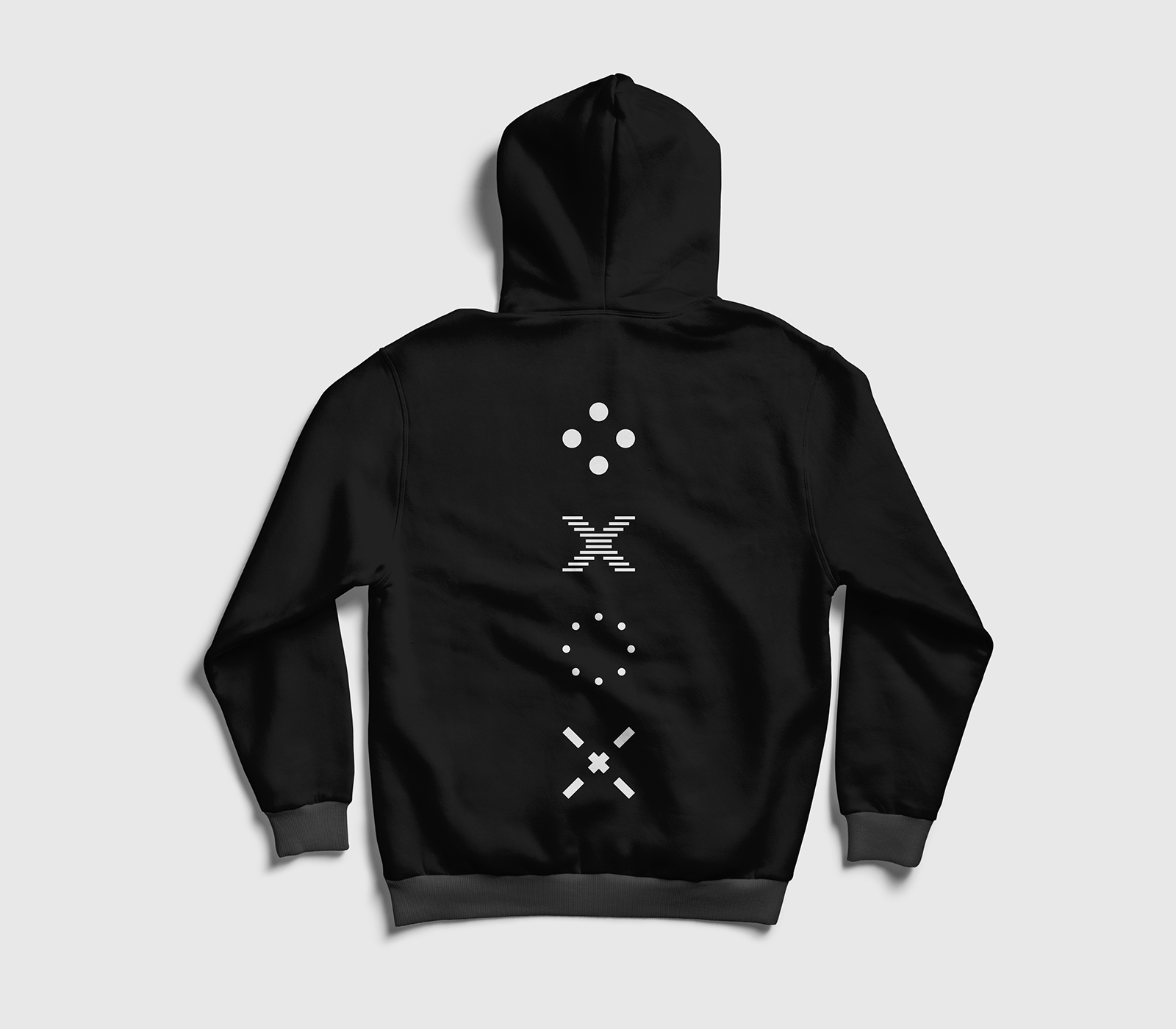
I also tested the branding on some apparel. derSchwarzmaler naturally needs also a pitch-black hoody with grey details. What else? Furthermore I put the logo on a cap to complete the style.
You could use some black magic?
☞ Let’s have a talk.