
Actually, this is more a rebranding. The name JALASTAIR is a combination of John and Alastair, the English versions of my first names. So also the logo/symbol should illustrate this combination. So I decided to create a monogram. After some sketching, I came up with this idea and really liked the contrast of thick plus thin lines. The starting point for the vectorization was a geometrical form. Then I had the base for the monogram and the final step was to adapt the thickness. Voilà.
I’m using this name or brand for my activities as a designer as well as a musician. The symbol and the letter mark will be consistent but the two roles will visually differentiate.
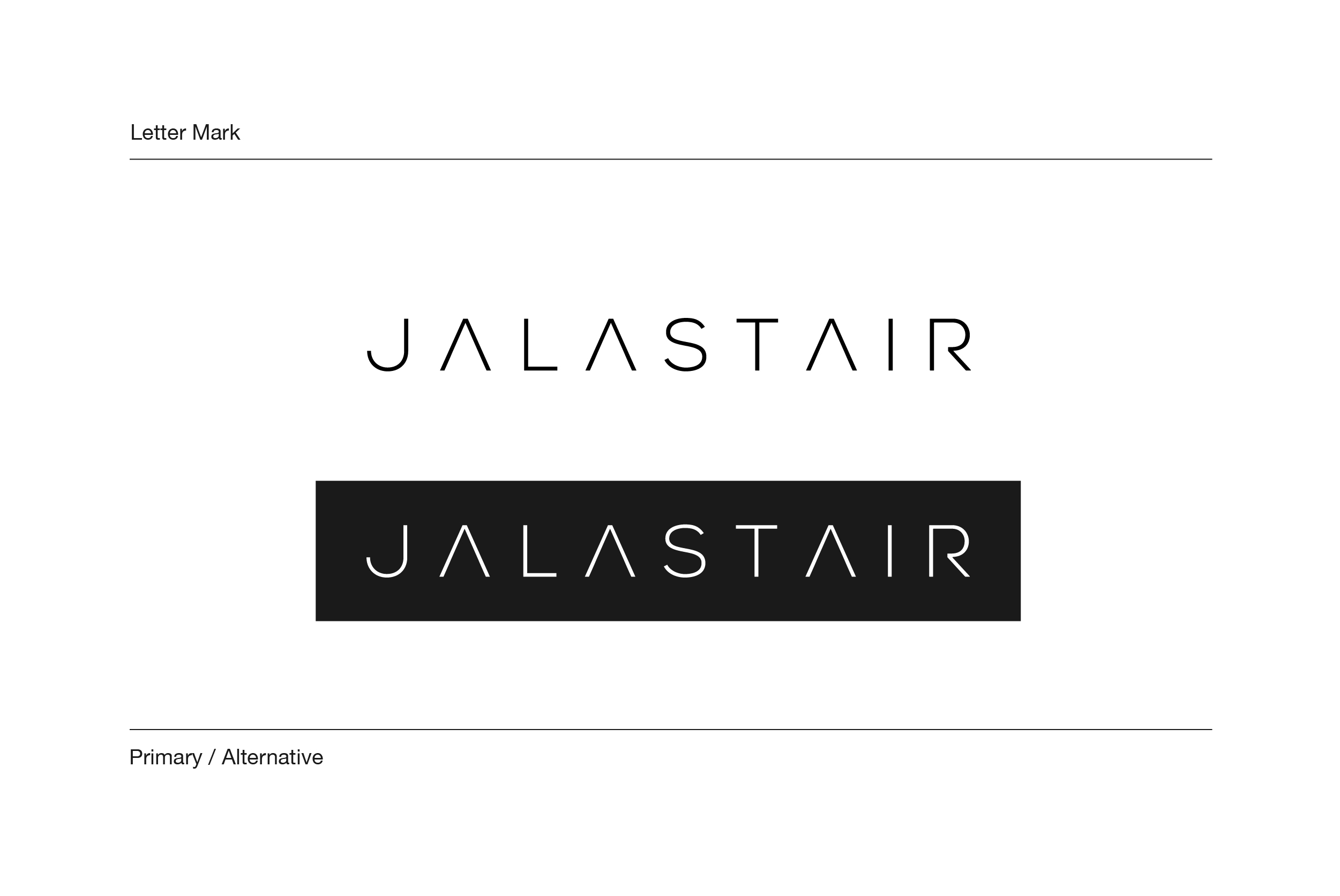
For the letter mark I used the font Nexa Light as the basis. This font is also used for different logo variations and badges, you find them below. I adapted the font and the letters to create this mark. I added some more spacing between the letters and also changed the A and the R. I deleted the horizontal lines to get a one line look.
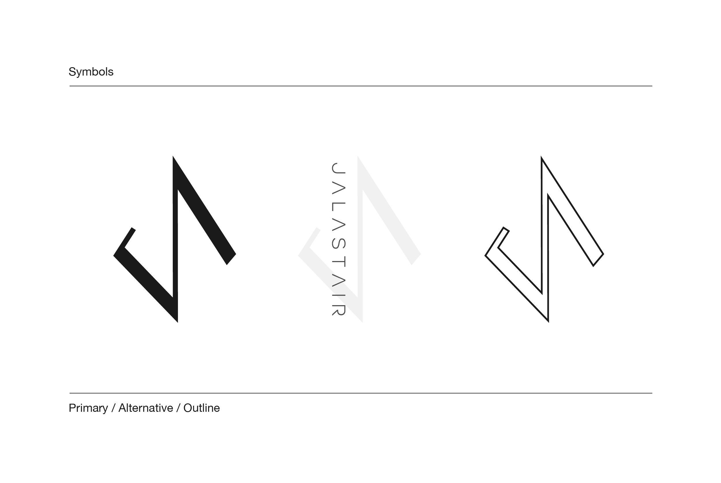
The primary symbol and the one that I will use the most is the left one. This one is also part of some badges and is great for cutting something out with the laser cutter for example. The other ones are some alternatives but I’m not really sure at the moment where I will use it. I used the second one already in one of my single artworks below and maybe it’s a variation that I will mainly use for my music stuff.
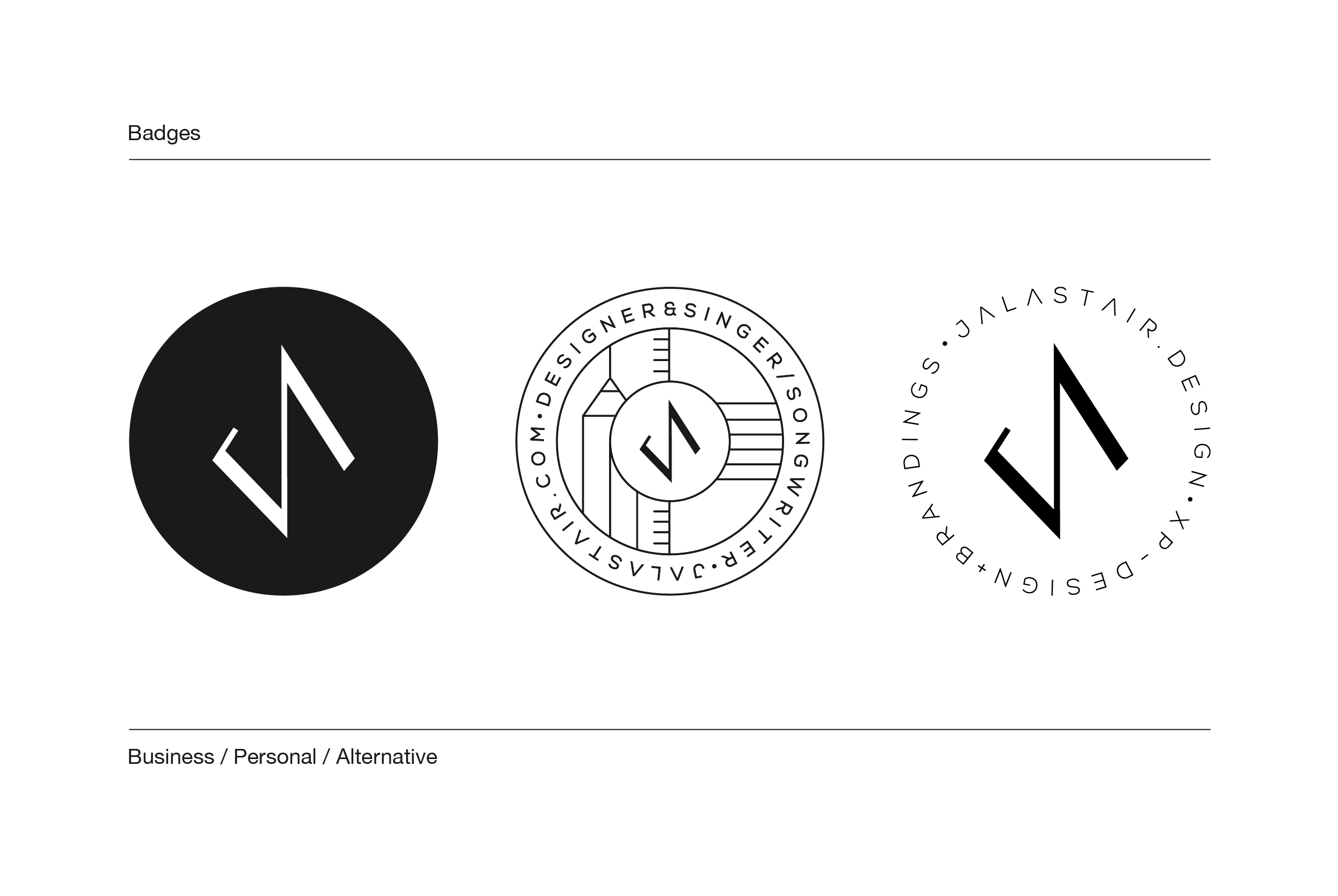
Honestly, I’m not a hundred percent sure how I will use the badges but I think the first one is the one I will use for my design activities because it’s clear, neutral and minimalistic. I also will use this as the basis for my business cards, more on that below. The second one is inspired by the crest of Inter Miami CF which is maybe one of the best club crests in my mind. I always wanted to have something like that for me, so I created such a badge/crest also for me. The third one could be used as a stamp for example but is just a backup for now.
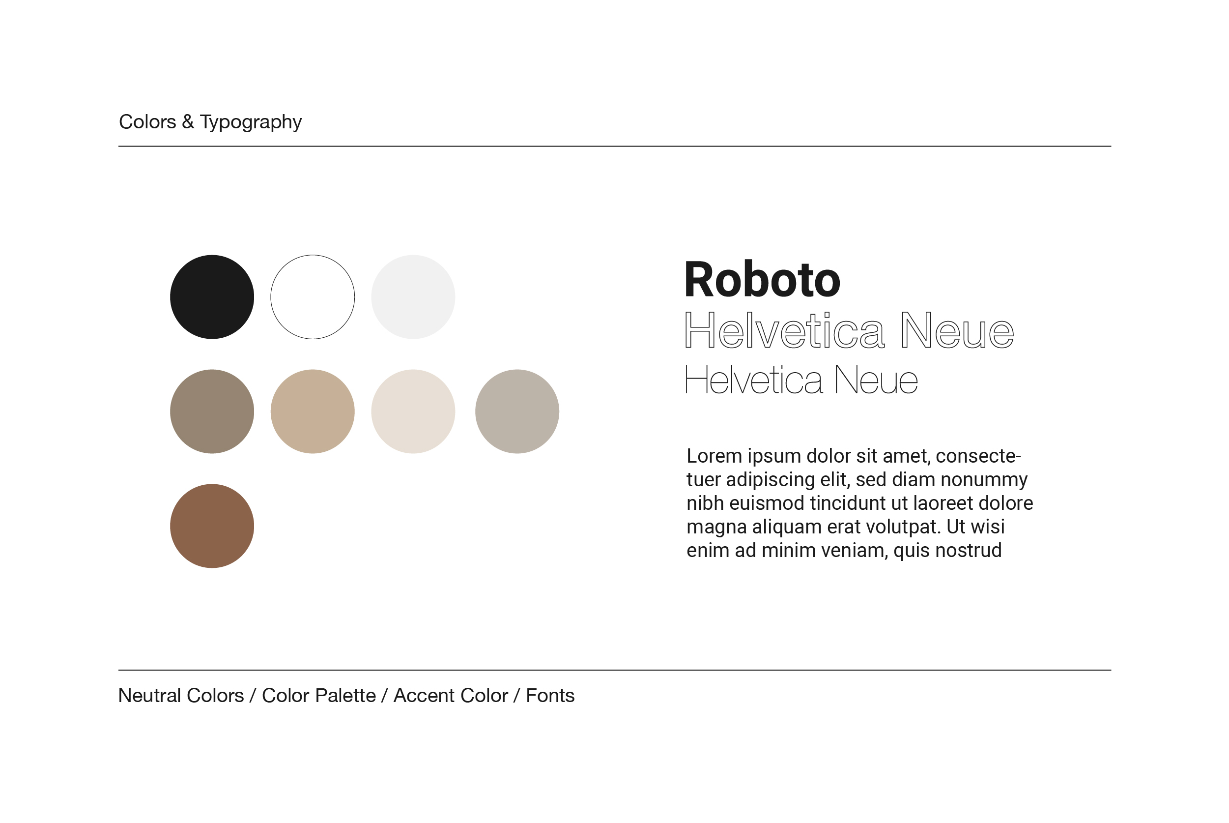
First I had a more flashy and colorful color concept but I found out that the colors I wanted will not really work on print and I would have trouble finding the right tone even though it was a Pantone color. Now I decided to go with something more neutral but elegant. Furthermore, I wanted my colors to match my office materials. I buy my sketchbooks and other materials from a manufactory called Typp based in Berlin that crafts by hand plus uses only recycling materials.
The primary colors are still a very dark grey, almost black, and white. The complementary colors are some brown tones, a light craft tone, and a light grey. The accent color is bronze {PANTONE 876 C}, which looks great on white. In terms of font, I use some common fonts like Helvetica Neue and Roboto. The first line is in Roboto and the second one is in Helvetica Neue (outlined). The body text is again in Roboto. That’s my typography scheme.
![]()
For the cover of my Instagram highlights, I needed some icons that represented the content of them. So I made these five icons for my Instagram account. For sure this list will grow in the future.
Some existing designs for my own music
Single Artwork
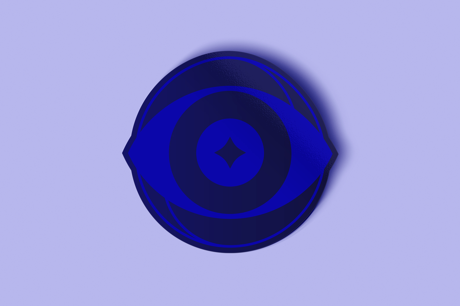
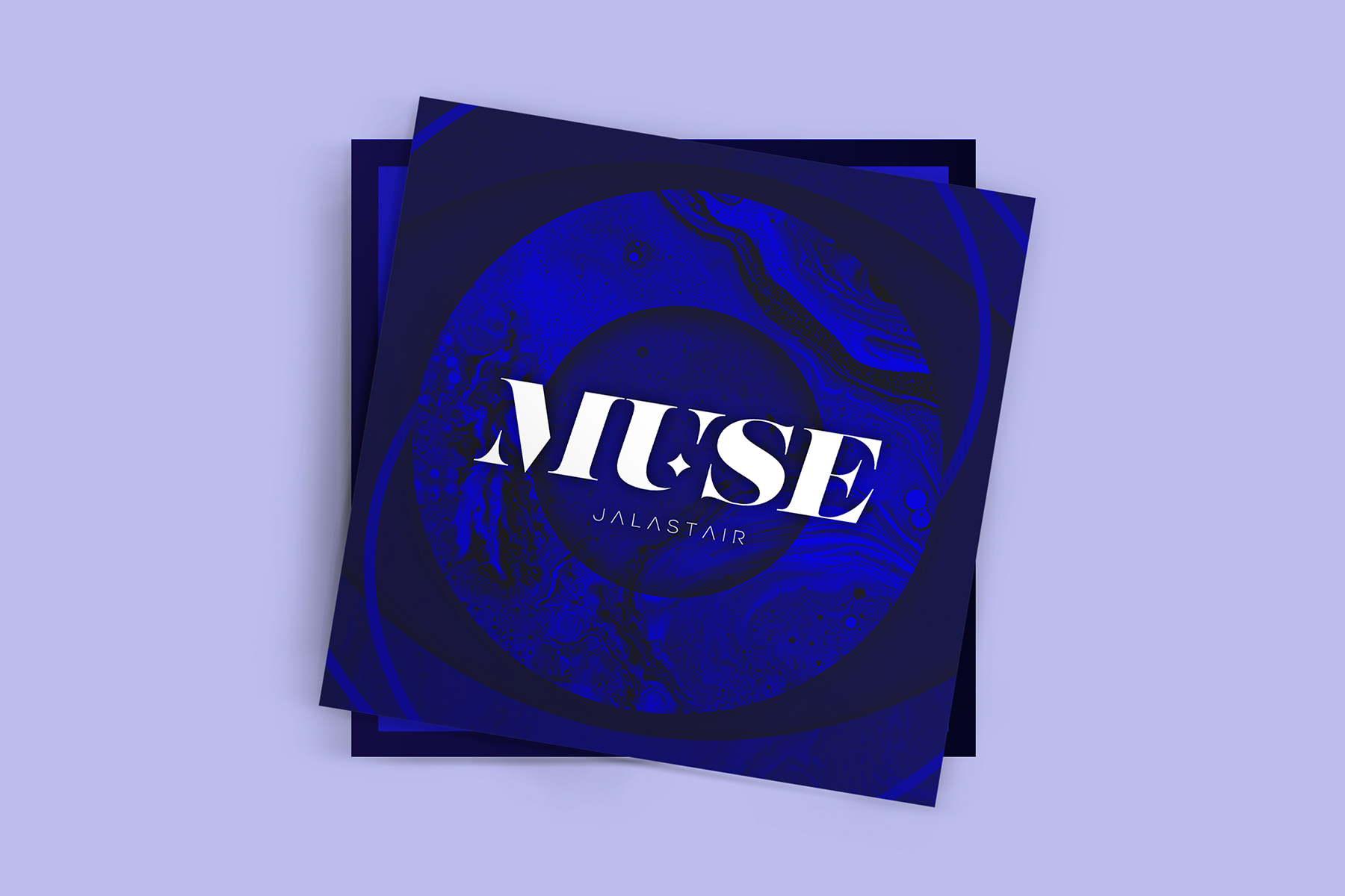
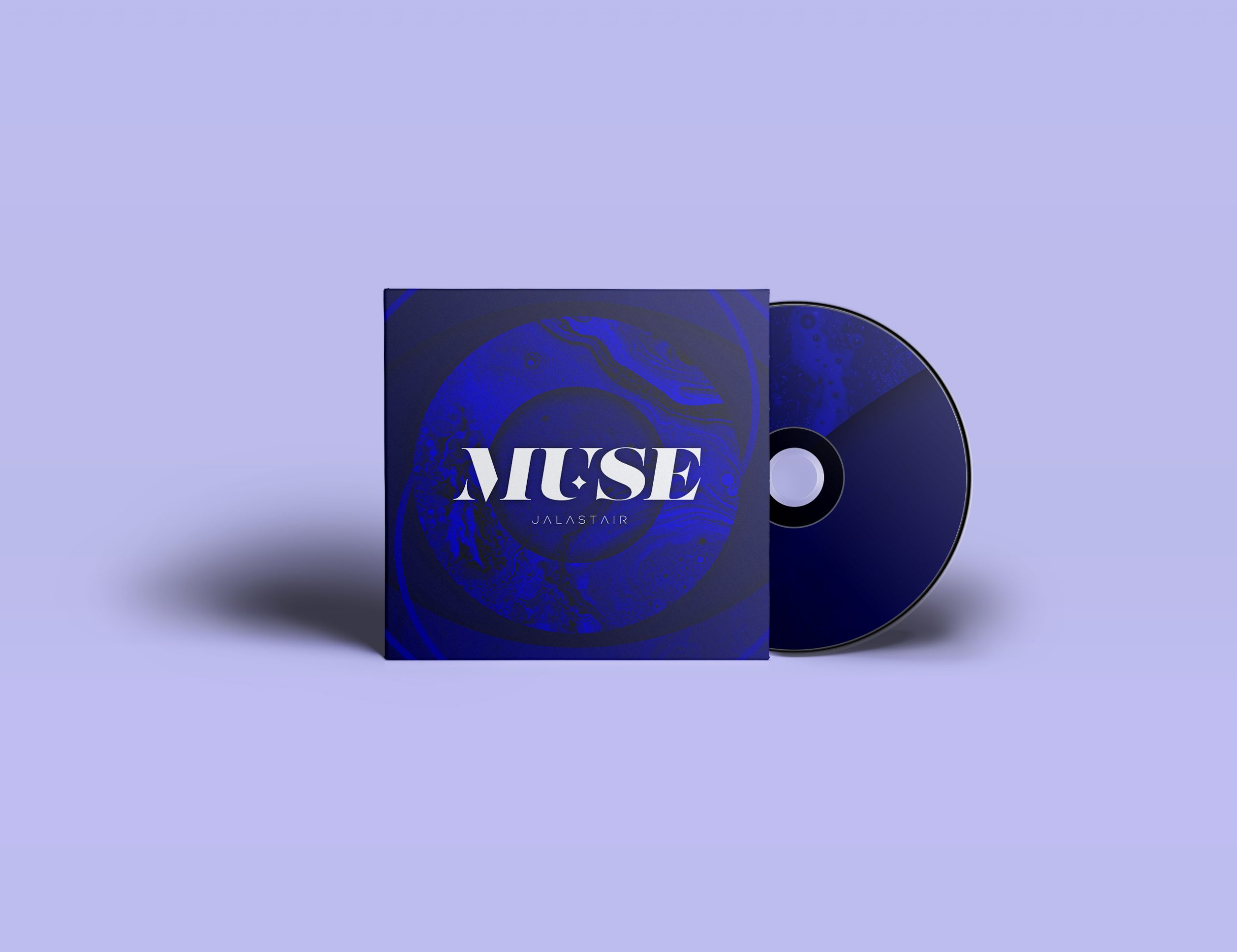
Muse
The song is about a person that inspires you to be the best version of yourself and is the anchor of your head.
As the word is, the eyes are the window on the soul. Therefore the logo and the artwork is built around the eye.
To promote the single I designed a sticker and a flyer that can be distributed among bars, coffee houses and so on.
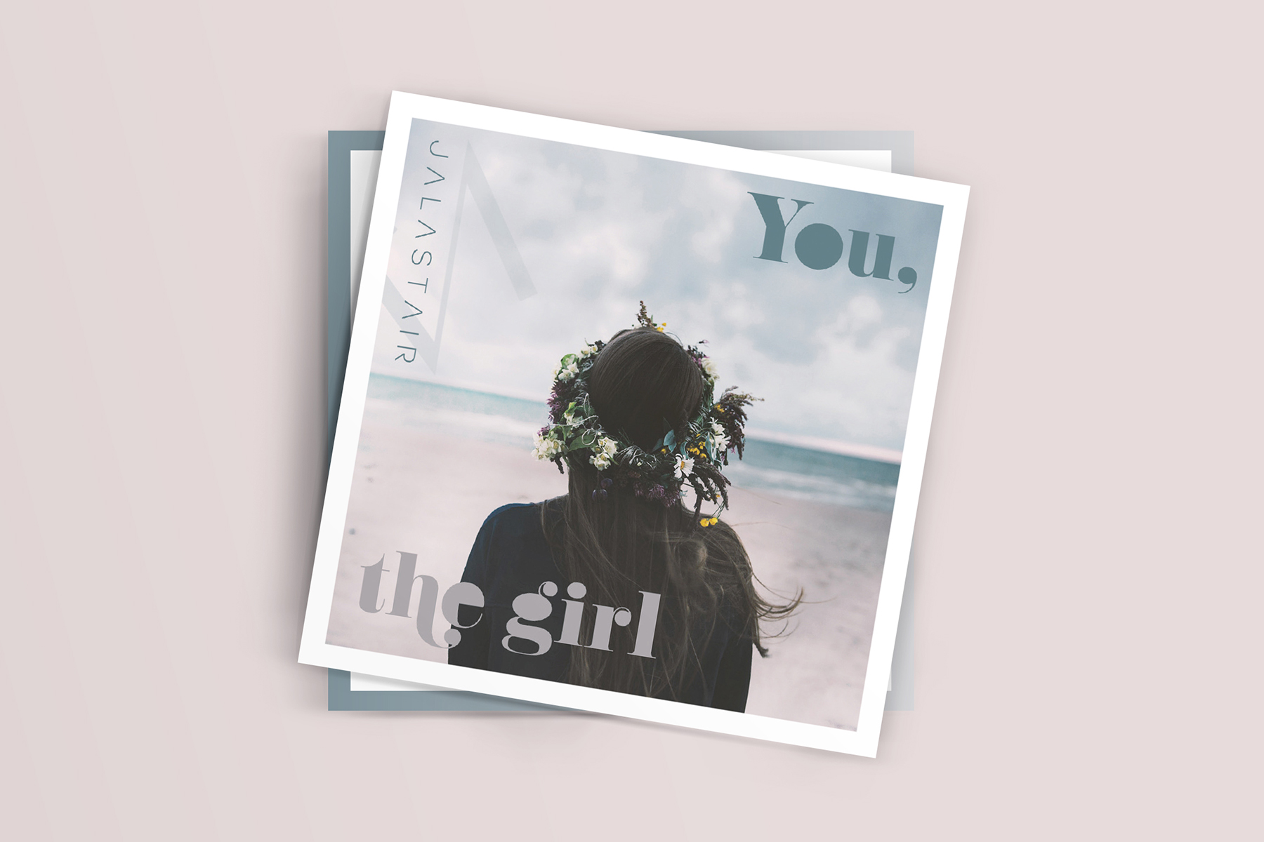
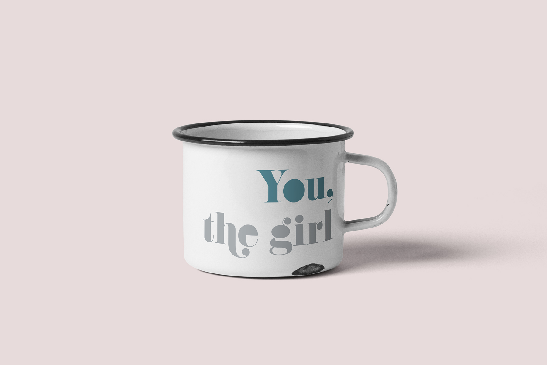
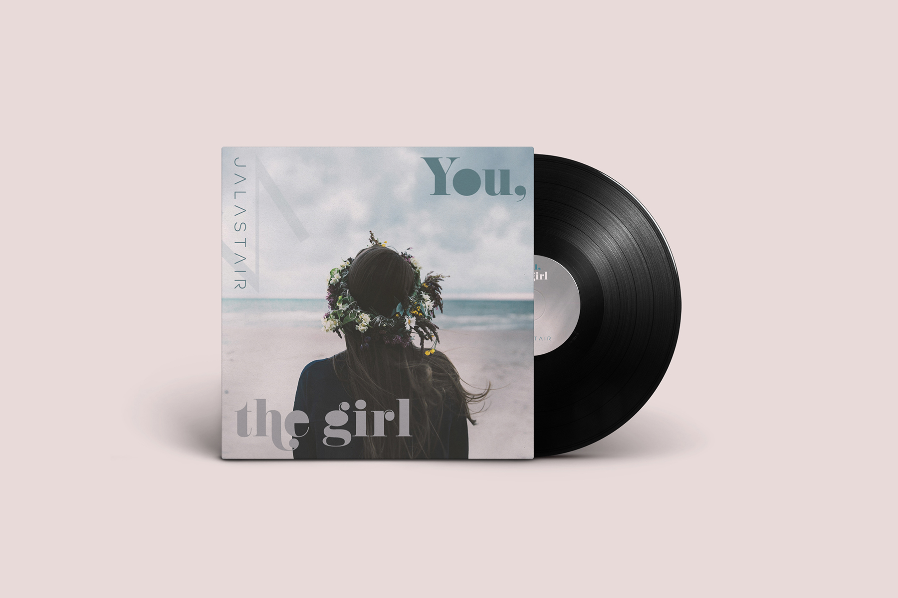
You, the girl
The song is about that one girl. The struggle of finding her and not losing faith in life that the day will come.
The artwork of the single tries to symbolize the substance of the story and the message. A picture of a mysterious girl in front of the sea.
Also for this single I created a flyer to promote it. Besides that, I made a design for a merchandise article, a metal mug.
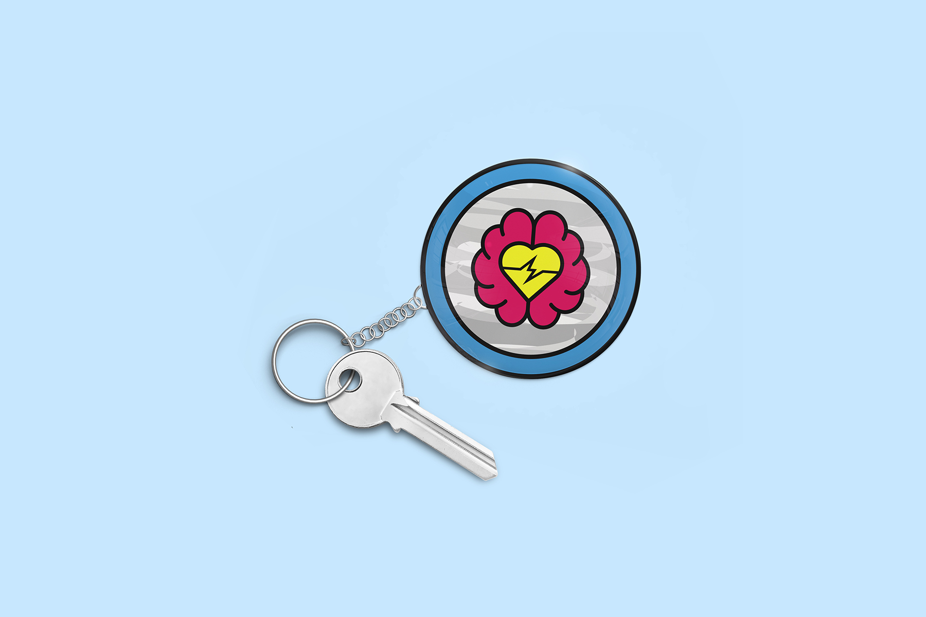
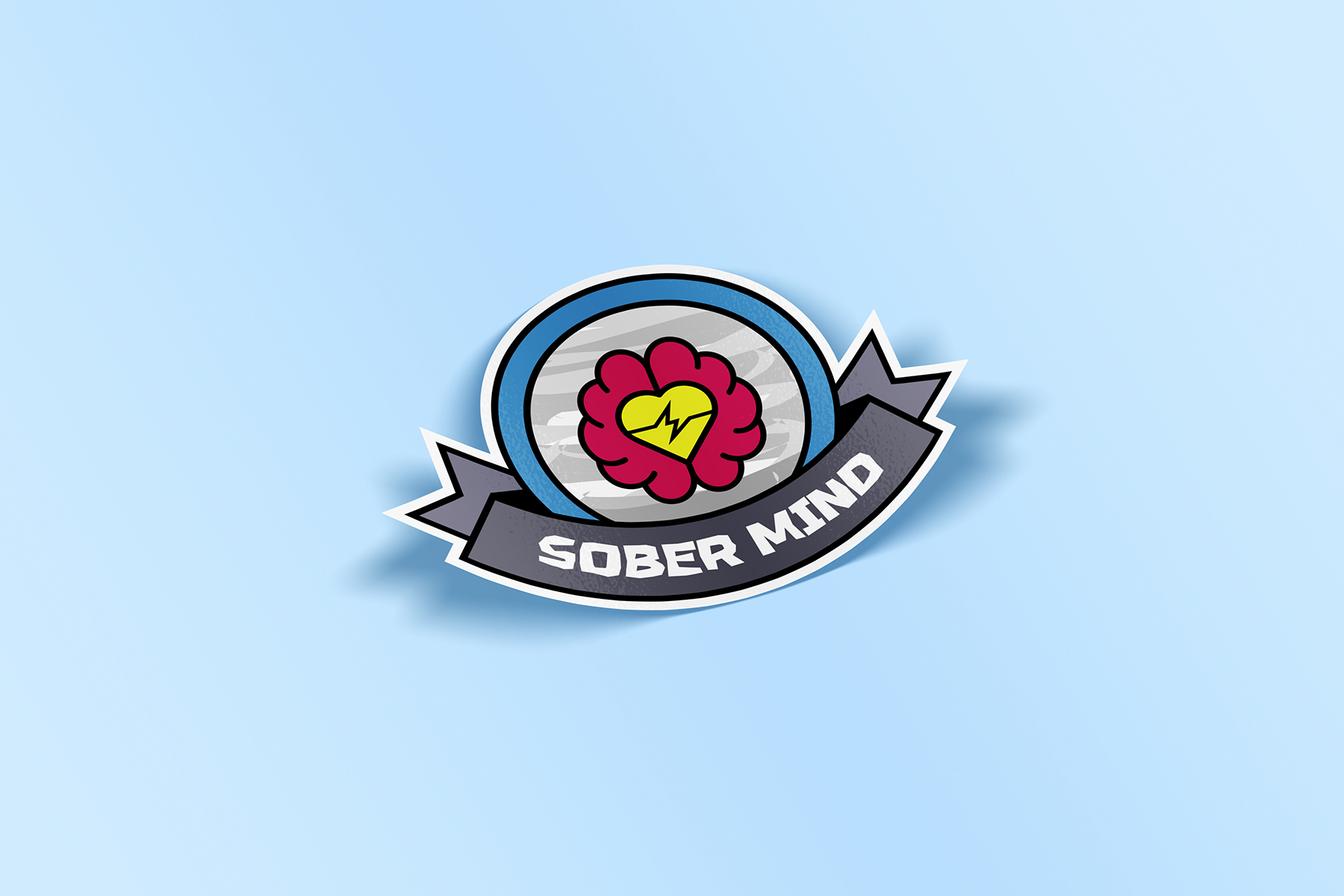
Sober Mind
The song is about moments in life where the mind is in conflict with the heart. At this point, the mind is anything but sober.
The single artwork is at the moment in progress. It’s all up in the air. Maybe the artwork won’t contain the design of the logo.
The sticker or the logo was the starting point and one of the first stickers for JALASTAIR. I also figured out that it can work as a keychain.
Are you in the need of a visual identity?
☞ Let’s have a talk.