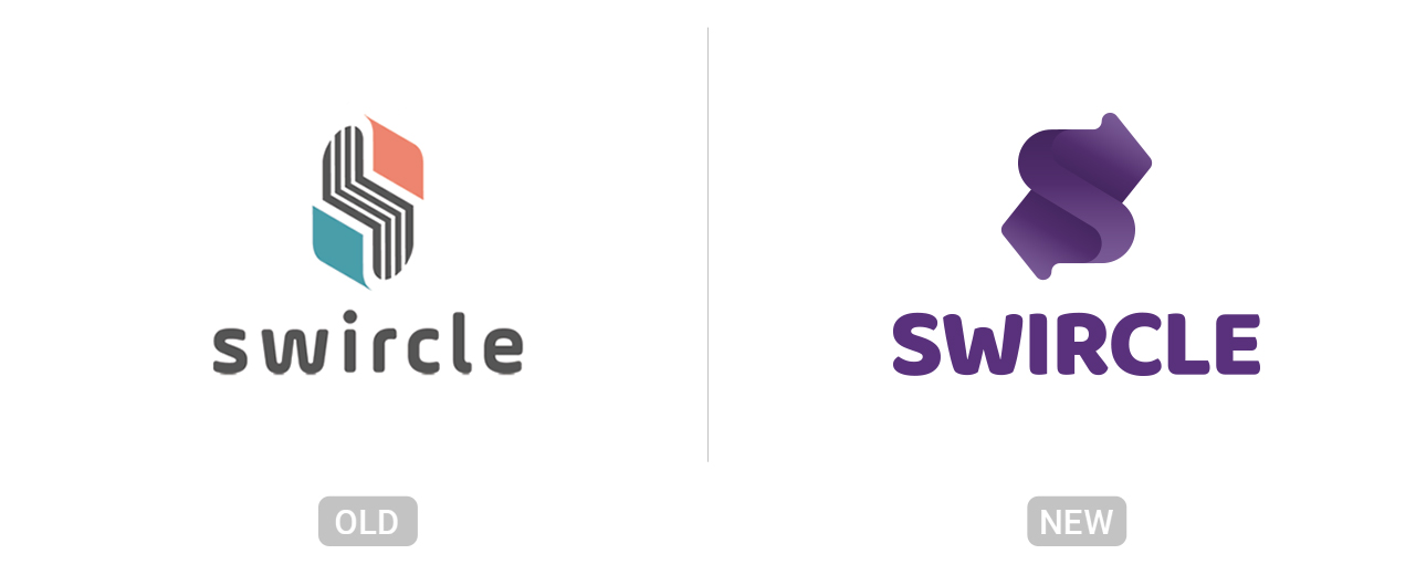
Rebranding concept for Swircle. It’s a technology-based startup established by the female entrepreneur Nancy Wang. She is developing an innovative and disruptive sharing model for a different kind of products. This sharing model will start children books.
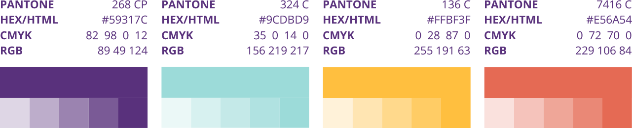
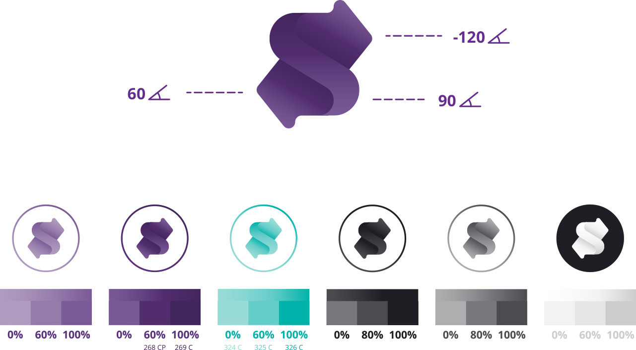
The target was to develop a logo that doesn’t restrict Swircle in the future when the startup expands to products beyond the children’s industry and beyond books. Furthermore, it should be modern and simple. After some iterations and overruled ideas, we decided to visualize only the swapping and combine it with the letter s. The two arrows are a common symbol for the visualization of a swap or a transfer. At first, it was just a flat symbol but then I upgraded it with gradients to let it look more playful and interesting. Some of the colors were chosen because of their psychological meaning – purple (creativity), yellow (fun) – and the other ones complete the palette. Besides that, Swircle can now also choose between different gradients and colors for different purposes. So that the startup and third-party supplier use the branding correctly, I created a guideline that includes all the following elements.
Design Process
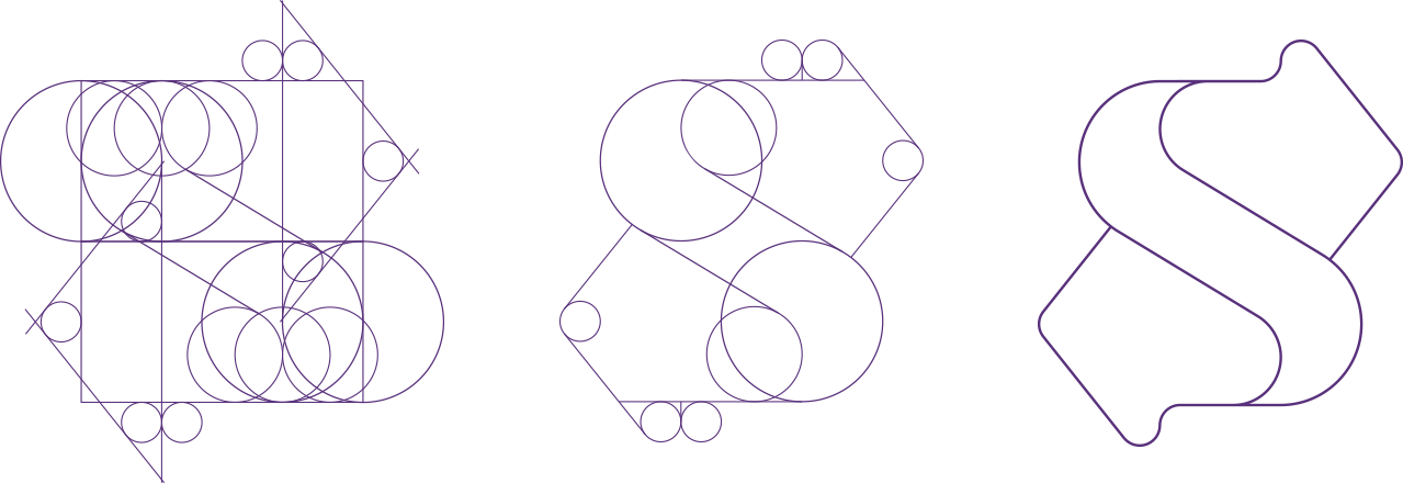
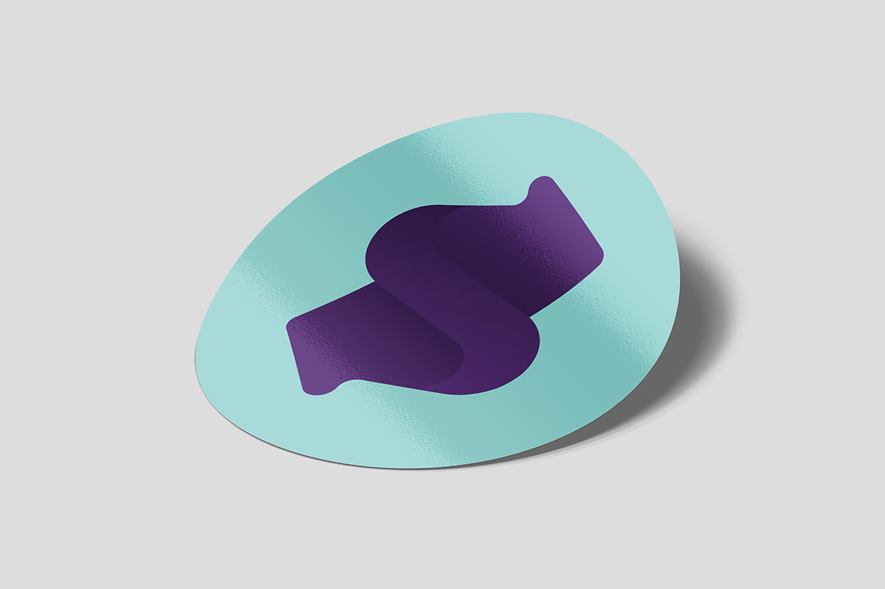
Shapes of the Symbol
Color Palette
Primary Colors Print & Web
Gradients
Different Variations
Primary Mark
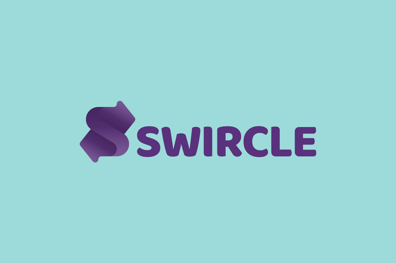
Main Logo
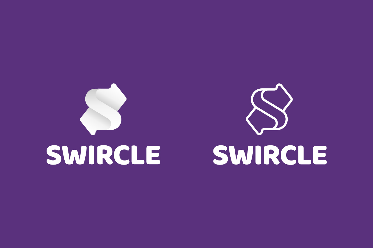
Alternative Marks
Rectangular / Outline Version
Inverted Primary Mark
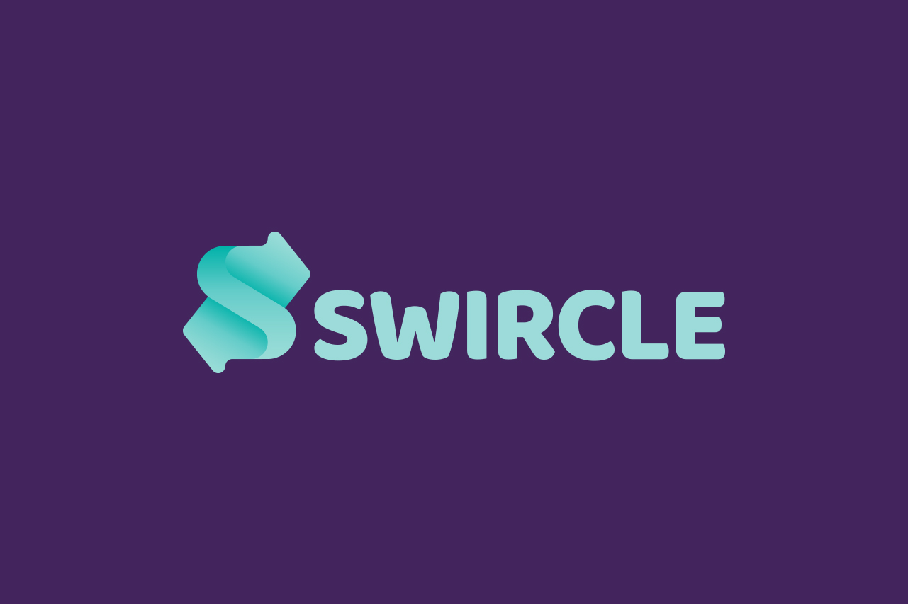
Switched Background and Logo Colour
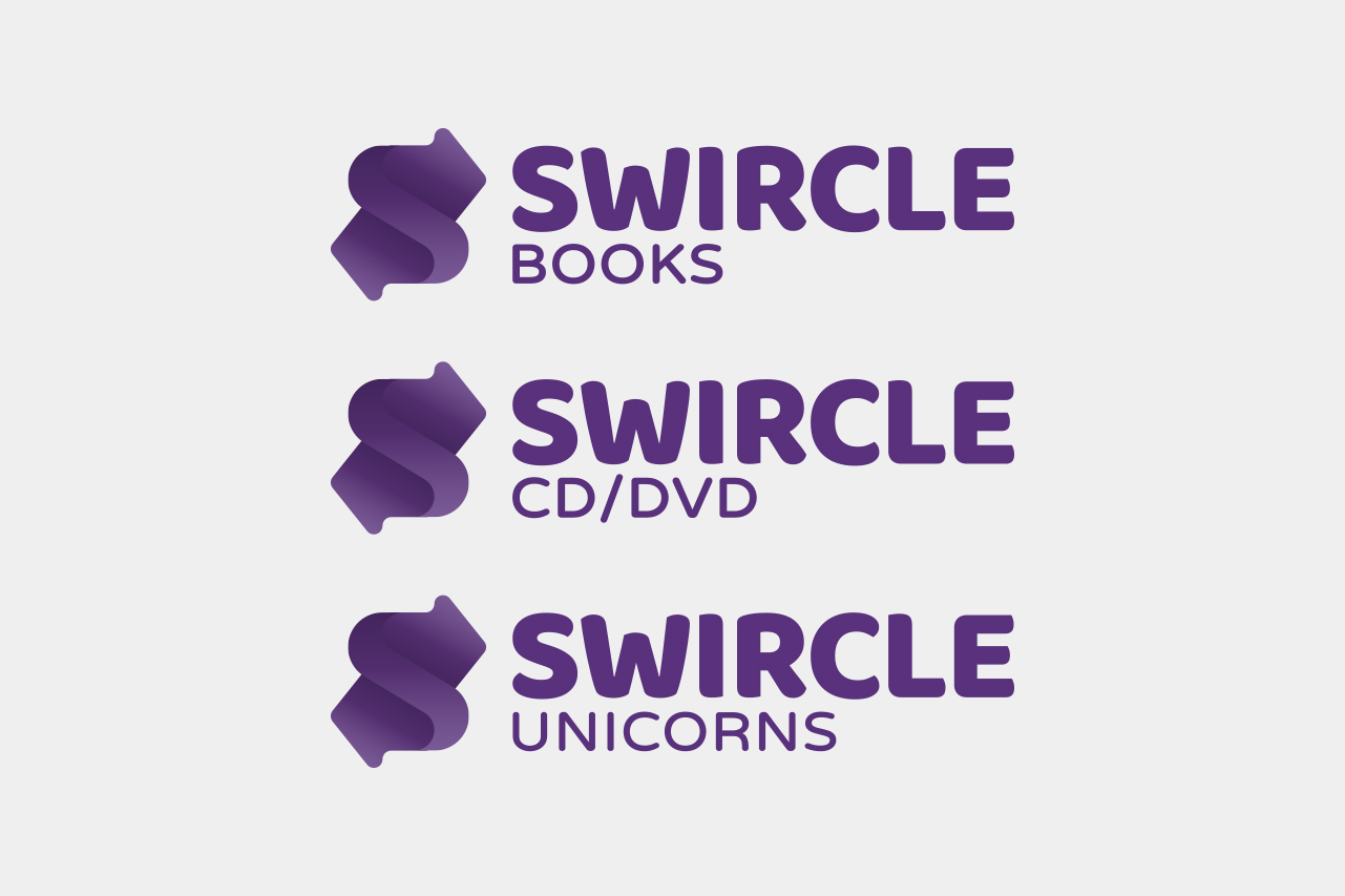
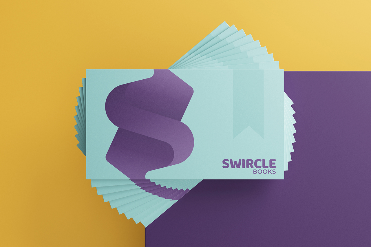
Logo Mark with Subtitle
For different Products
App Icons
Different Options
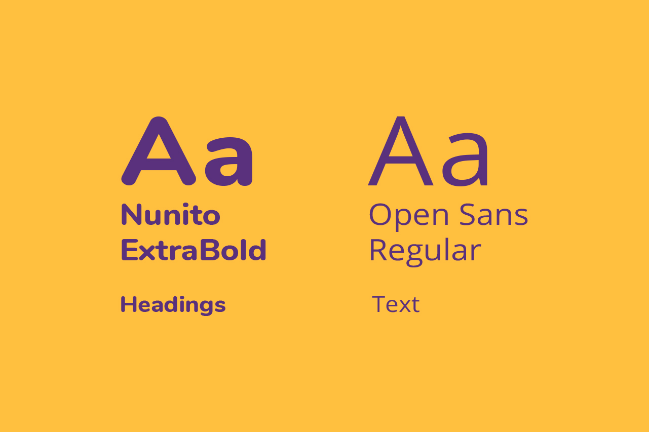
Typography
Based on Google Fonts
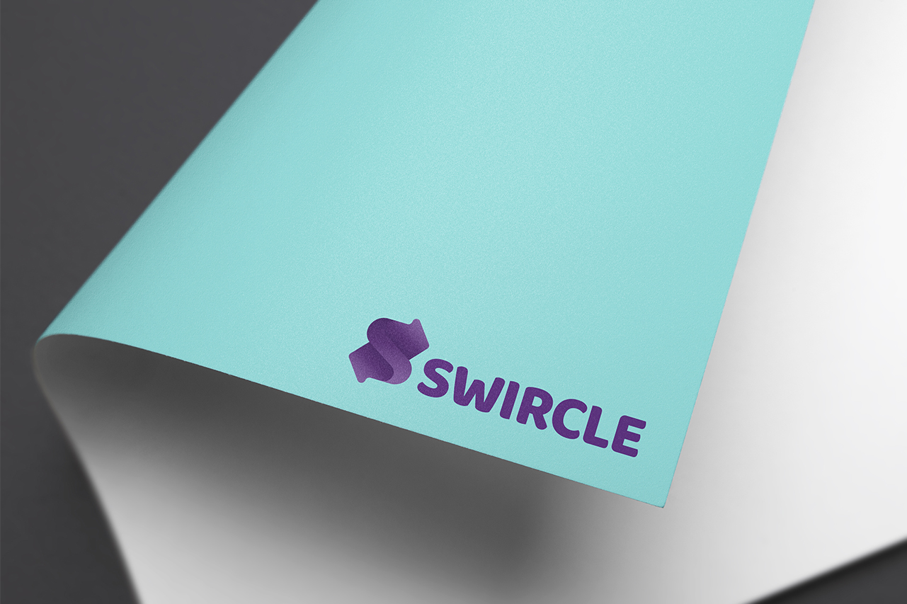
Other Stuff
Print Design Examples
Do you also think of reinventing your brand?
☞ Let’s have a talk.