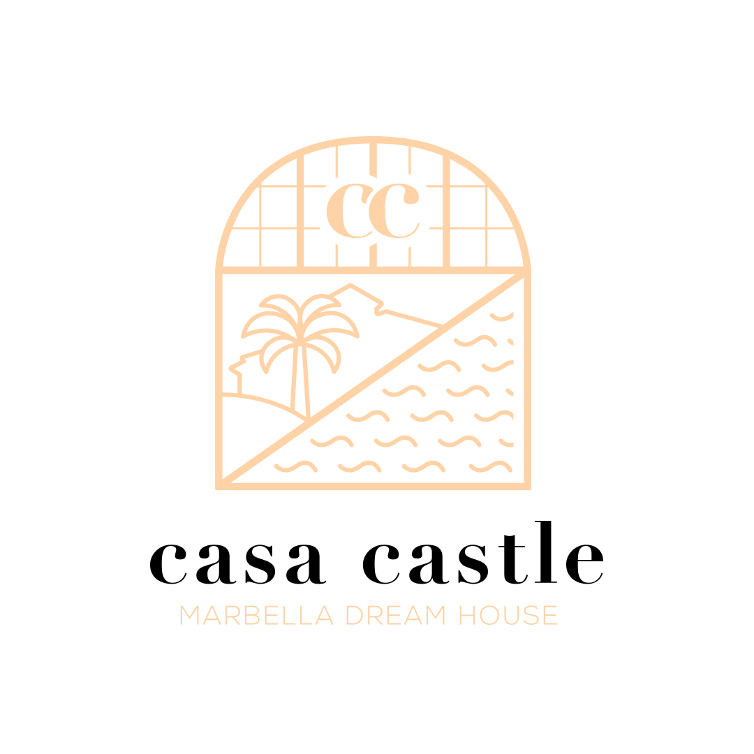
casa castle
I watched the Vlogs of Jon Olsson for a long time. After he released the video of his new house casa castle in Marbella, he opened a logo competition. I had some time and thought, why not. So I gave it a try.
Badge Design
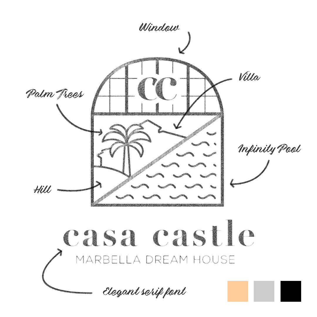
After some brainstorming, I came up with the idea to create a badge, which combines some unique elements of the house that Jon mentioned in his Vlog. These were:
– the big window/door in the living room
– the shape of the villa
– the infinity pool filled with salt water
– the palm trees (he’s a palm tree nerd)
– and the last element, the hill.


Color & Font Concept
The color concept refers to the interior of the house and the outdoor furniture, which he designed in cooperation with Bauhaus. In terms of font, I needed something elegant. I also mentioned that Jon likes serif fonts and therefore I chose one of these. Even if it wasn’t the winning logo, I think it worked out pretty well and looks really nice.
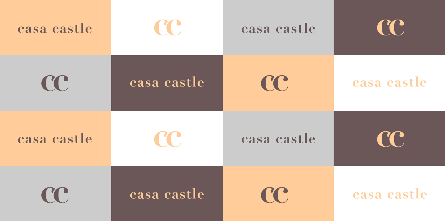
For other use cases he could have extracted the cc from the badge or he could also use the font based mark alone.

You need more than “just” a logo?
☞ Let’s have a talk.
