Surfskate Graz
Logo Design for the community
I felt inspired to create something for the Surfskate Community Graz after their content appeared in my social media feed. At the time, the community didn’t seem to have an established visual identity, so I decided to take on this voluntary project and create something meaningful for them.
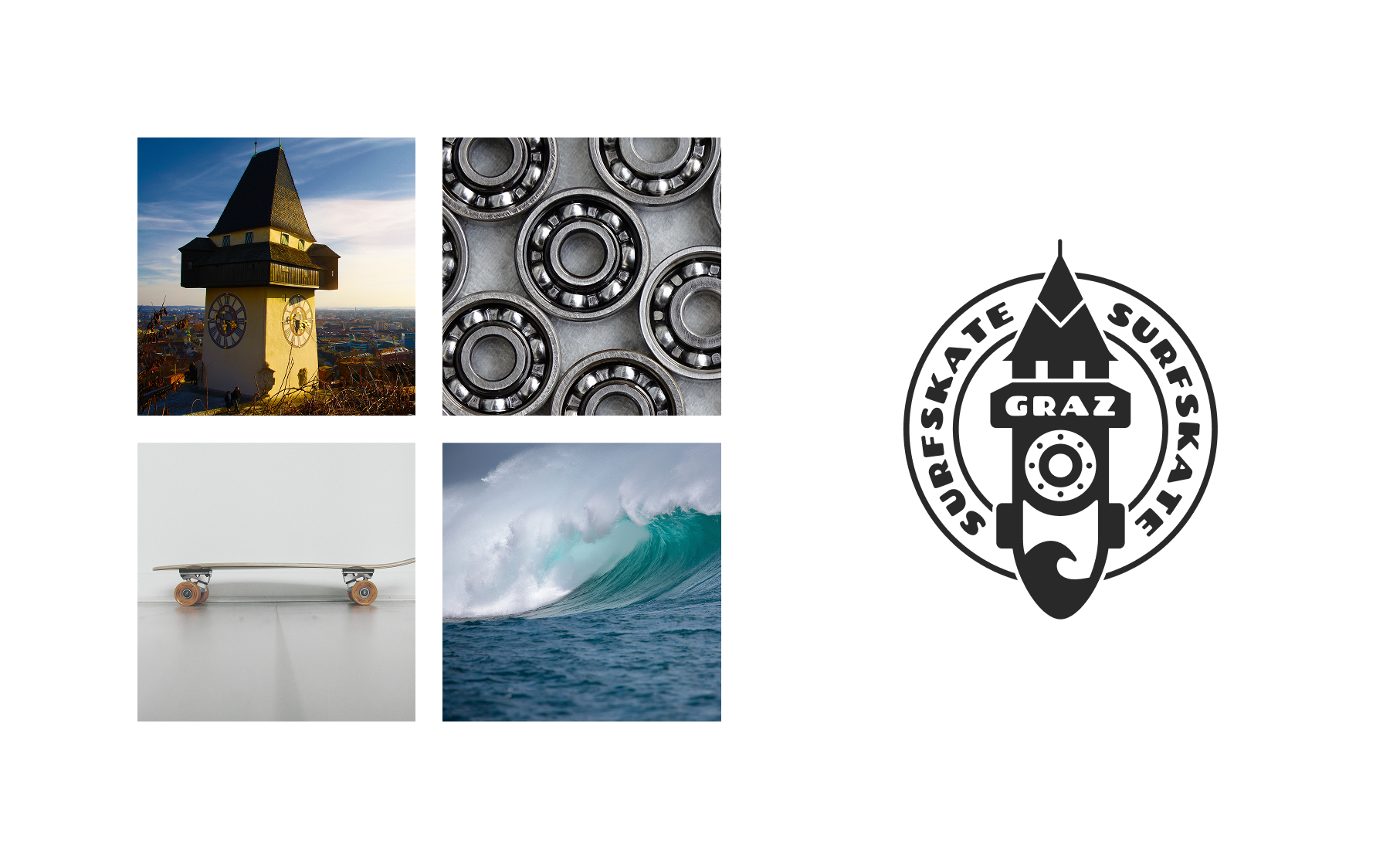
The main goal was to design a logo that would represent both the spirit of surfskating and the community’s connection to Graz. To make its origin instantly recognizable, I looked for a local landmark that could serve as the foundation of the design. The Graz Clock Tower (Uhrturm) was the natural choice.
During the design process, I explored how the tower could be integrated into the silhouette of a surfskate rather than simply placed alongside it. This led to the central idea of combining both elements into a single illustration. The tail of the board forms the recognizable structure of the clock tower, while the nose retains the characteristic shape of a surfskate.
I further developed the concept by incorporating two additional elements. The skateboard’s ball bearings became the inspiration for the clock face, creating a visual connection between the tower’s iconic clock and skateboarding culture. At the same time, the circular arrangement of the bearings reinforces the clock’s shape, allowing both elements to merge into one cohesive symbol.
Finally, I integrated a wave into the board itself. This detail represents the surfing influence behind surfskating and adds another layer of meaning to the illustration. Together, these elements create a distinctive mark that connects Graz’s local identity with the movement, freedom, and fluidity of surfskating.
Color Schemes
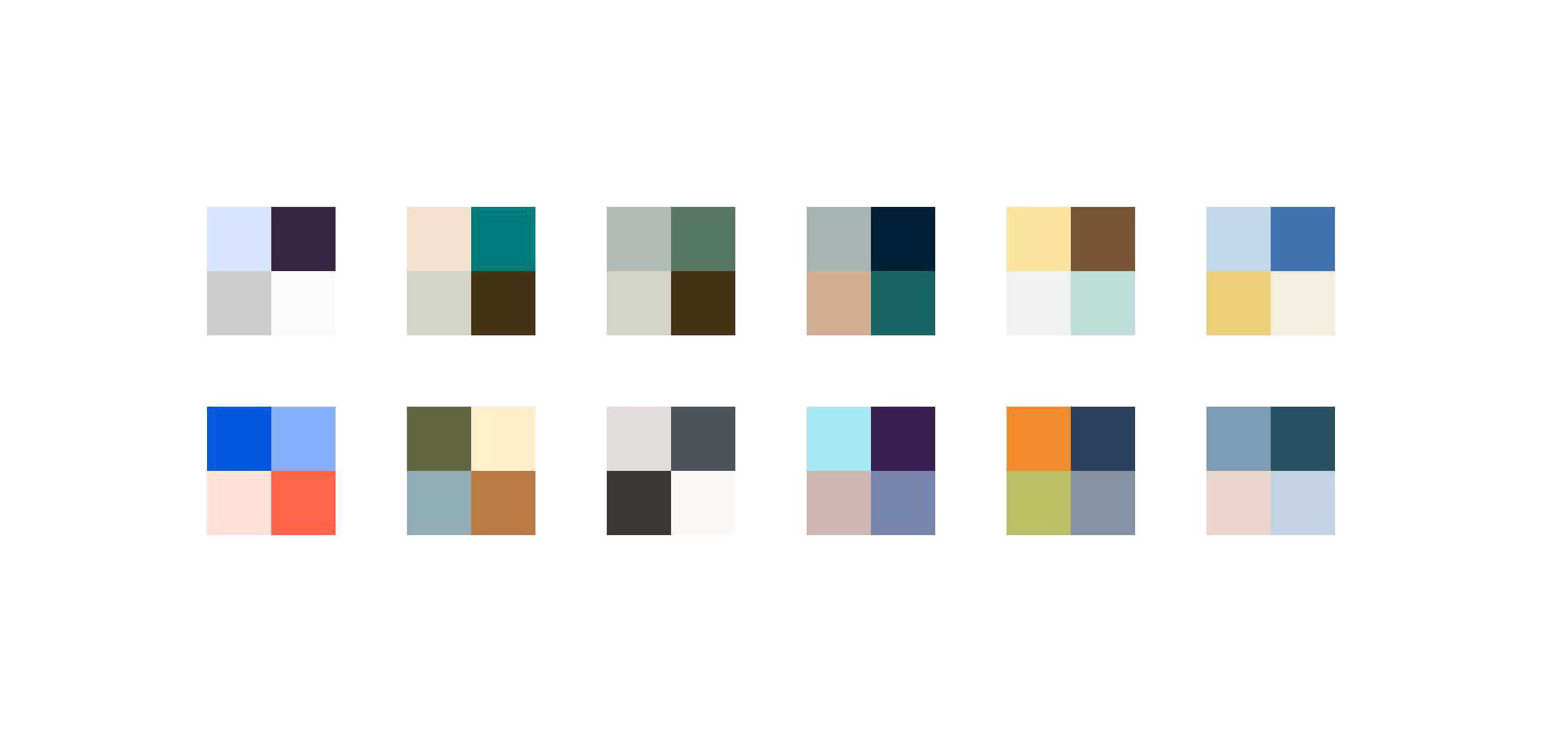
Color played an important role in defining the personality and overall feel of the logo. I explored several color combinations to find a palette that would reflect the energy of surfskating while complementing the bold, illustrative style of the design.
The different options explored a range of visual moods, from vibrant and energetic combinations to more subtle and balanced palettes. Each direction offered a different interpretation of the community’s identity, influencing how the logo could be perceived — whether as playful and expressive, bold and dynamic, or clean and timeless.
Beyond aesthetics, I also considered how the colors would work together across the different elements of the illustration. The palette needed to maintain sufficient contrast to keep the clock tower, surfskate silhouette, and smaller details clearly recognizable. It was equally important that the logo remained visually balanced and legible at different sizes, from digital applications to potential merchandise and printed materials.
To ensure that the final direction reflected the community itself, I presented the color variations to the founder and invited him to share which option resonated most with his vision. This collaborative approach helped establish a visual direction that felt authentic to the community rather than relying solely on my personal preferences.
Ultimately, the design was flexible enough to work across all the explored palettes. The final color scheme provided the preferred balance of character, contrast, and visual harmony, while preserving the logo’s distinctive identity.
Final Marks and Colors
Once the color scheme had been selected, I finalized the logo system and developed several variations to accommodate different applications and contexts.
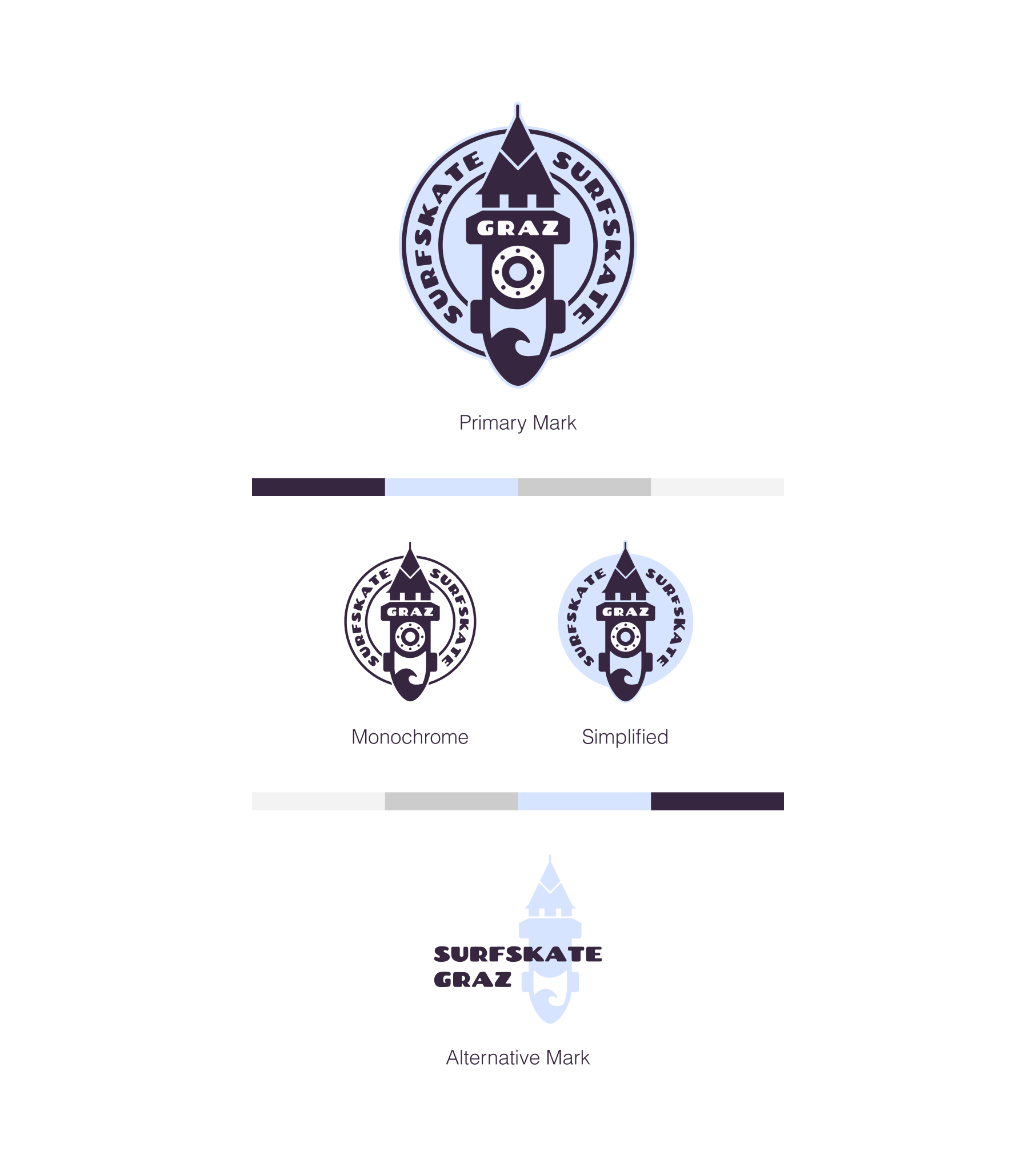
The primary mark combines all the key elements into the complete illustration, creating the most recognizable representation of the Surfskate Community Graz. Alongside it, I developed a monochrome version that relies on a single color. This variation offers greater flexibility for applications where multiple colors are impractical or unavailable, such as certain print processes, stamps, or single-color merchandise.
I also created a simplified version that removes the outlines and secondary details. By reducing the visual complexity, this variation creates a cleaner, more minimal appearance while retaining the essential silhouette and character of the design. It is particularly useful in contexts where clarity and legibility are important at smaller sizes.
Finally, I explored an alternative mark that takes a different visual approach while preserving the core concept: the combination of the Graz Clock Tower and a surfskate. Although it differs considerably from the primary design, it maintains the key visual references that connect the logo to both the city and the sport.
Together, these variations form a flexible logo system that maintains a consistent identity while adapting to different visual requirements and applications.
You need more than “just” a logo?
☞ Let’s have a talk.