
Cashit
Redesign of a POS solution for the Business Software GbmH
Cashit for Sage is a point-of-sale solution designed to support businesses in their daily sales operations. It enables employees to process transactions, manage sales, and handle checkout processes efficiently. The software plays an important role in everyday retail operations, where a clear and reliable user interface is essential for fast and intuitive workflows.
My responsibility was to redesign the existing Windows-based POS application, using Windows 10 UI components as the foundation for the new interface. The goal was to modernize the visual appearance, establish a consistent design language, and improve the overall usability of the system. Since checkout software is often used in fast-paced environments, particular attention was paid to clear visual hierarchies, intuitive interactions, and efficient workflows. Throughout the redesign process, I also considered the technical feasibility of the proposed solutions to ensure that the new interface could be implemented within the existing software environment.
Product Visualization
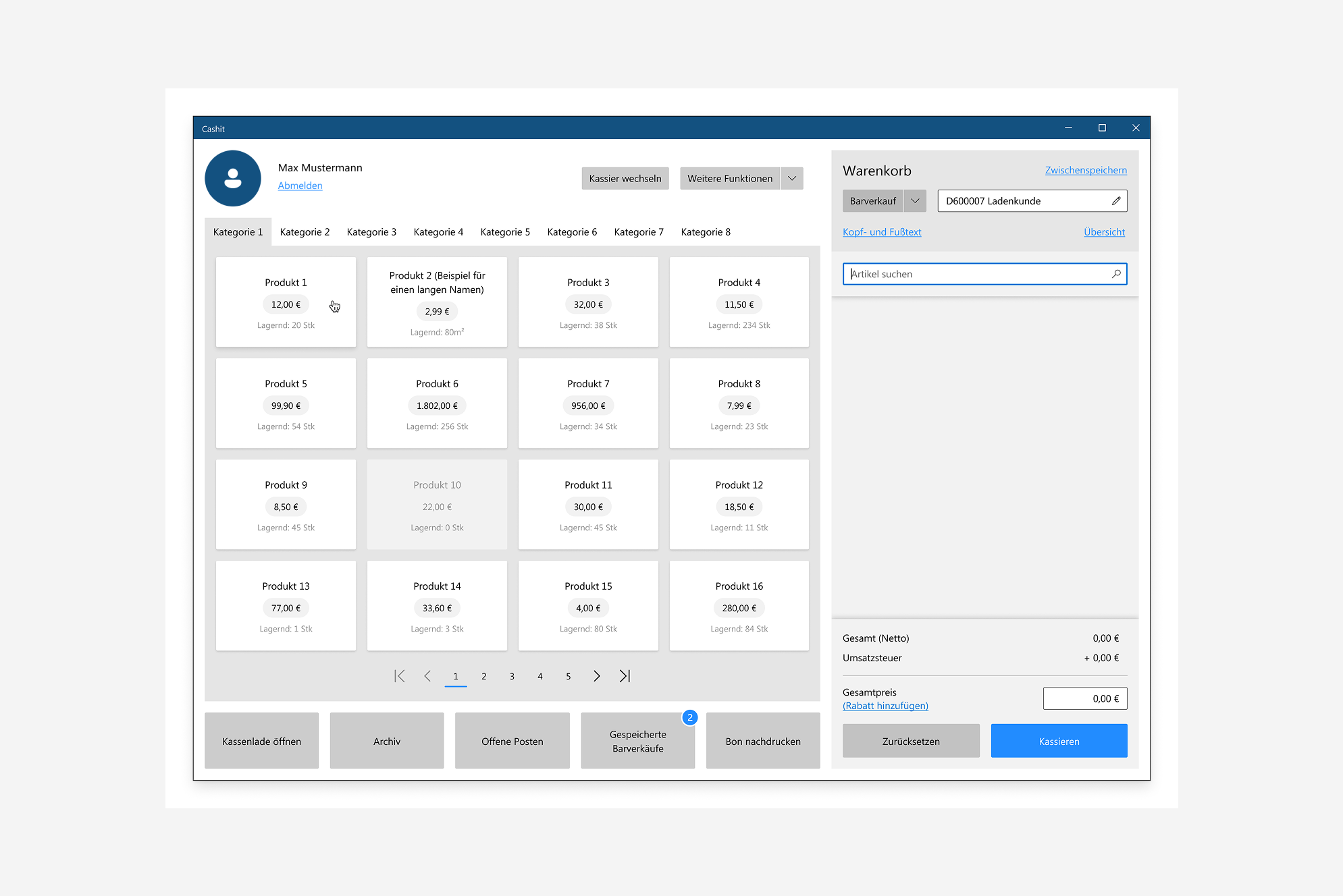
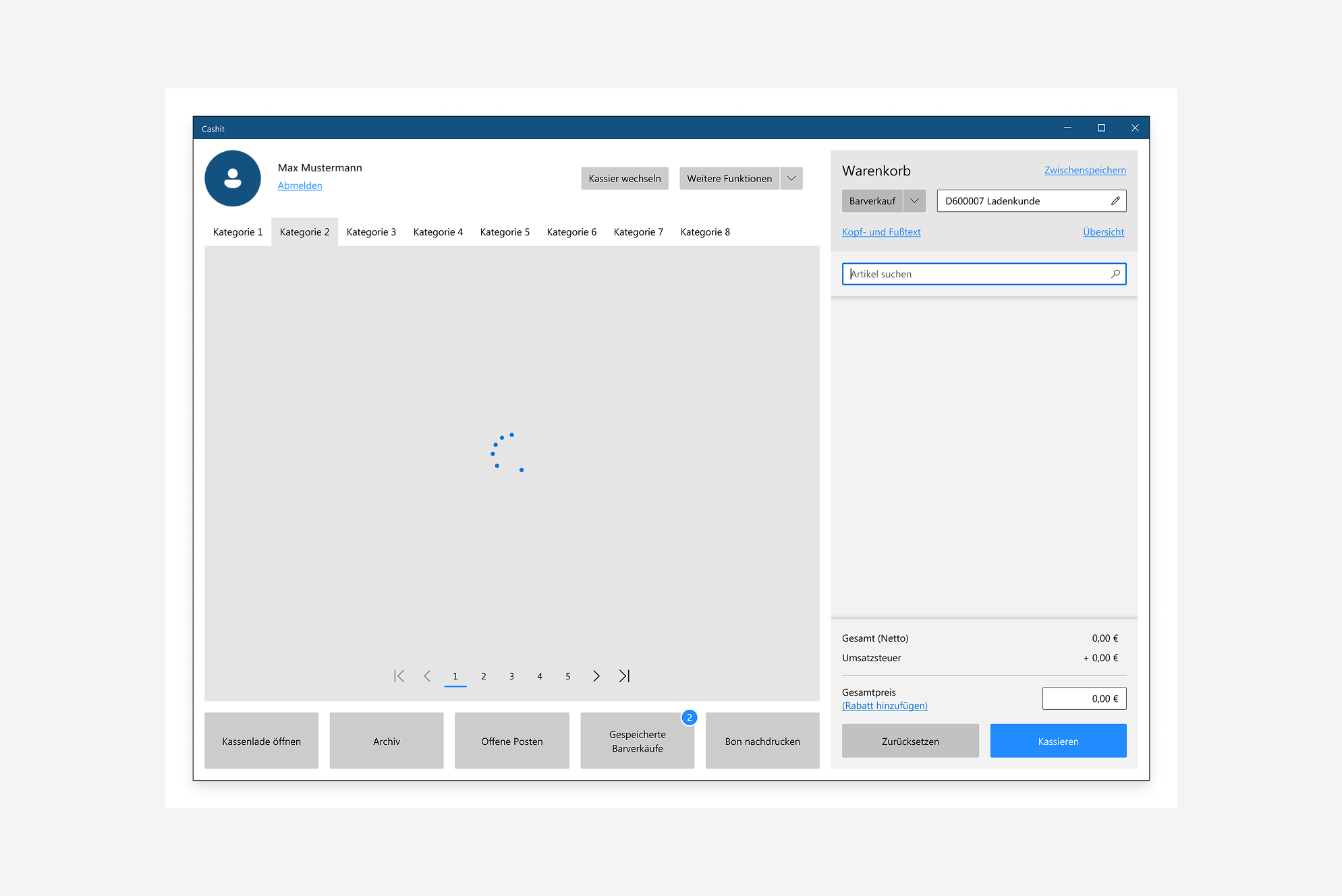
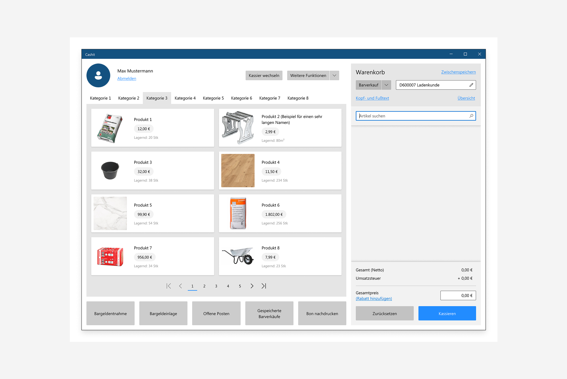
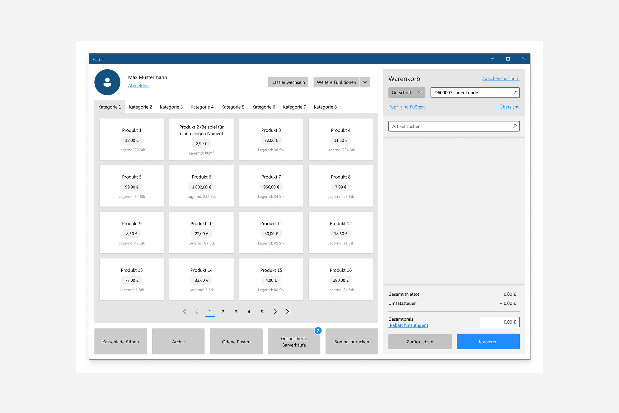
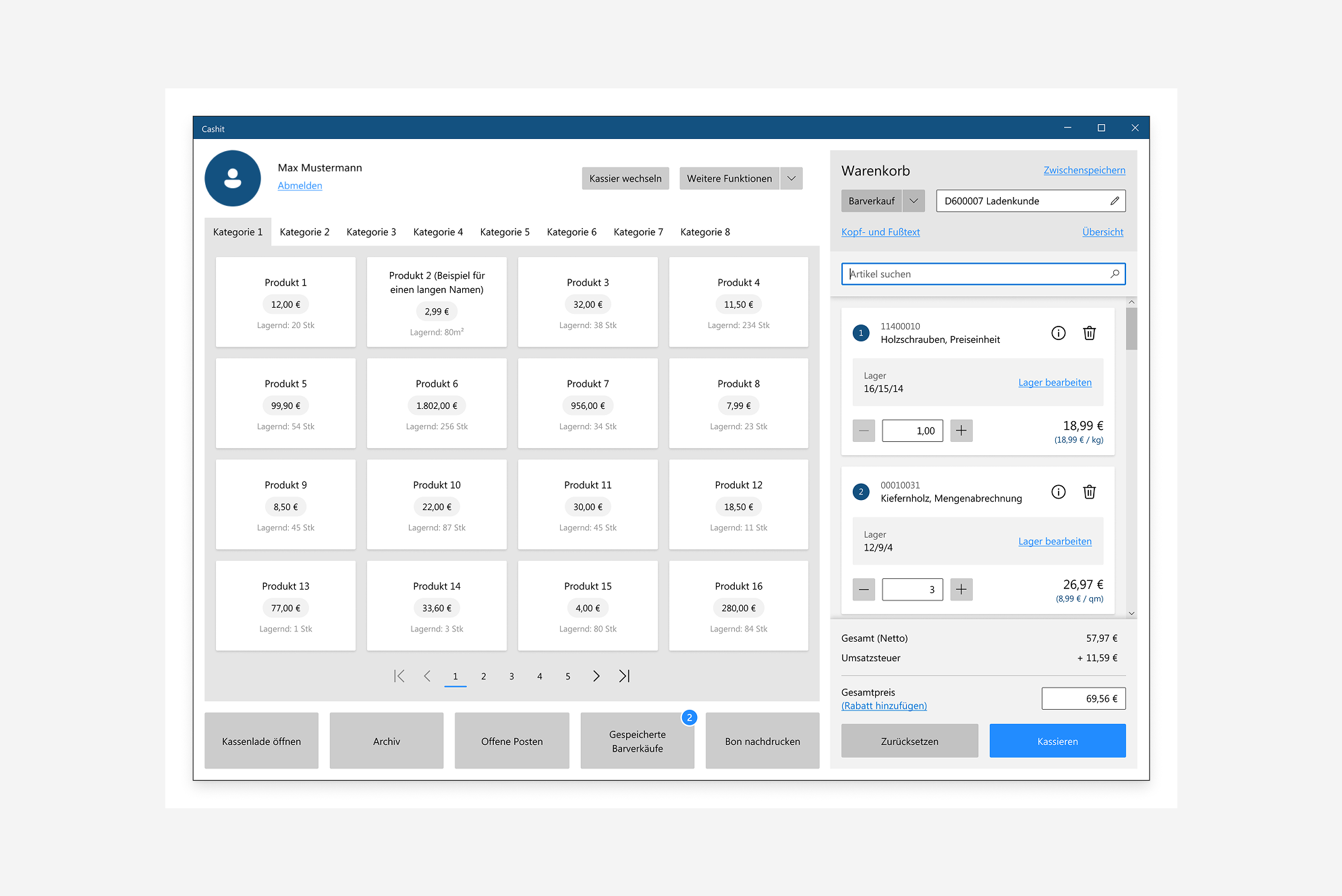
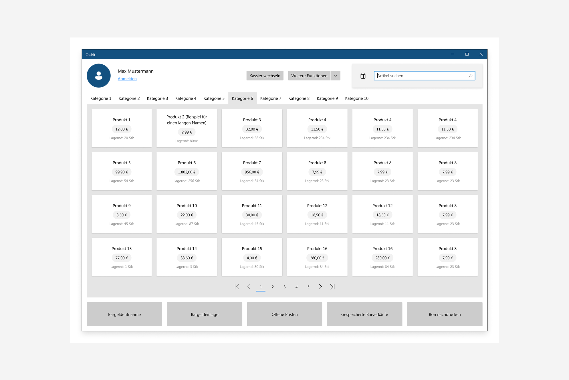
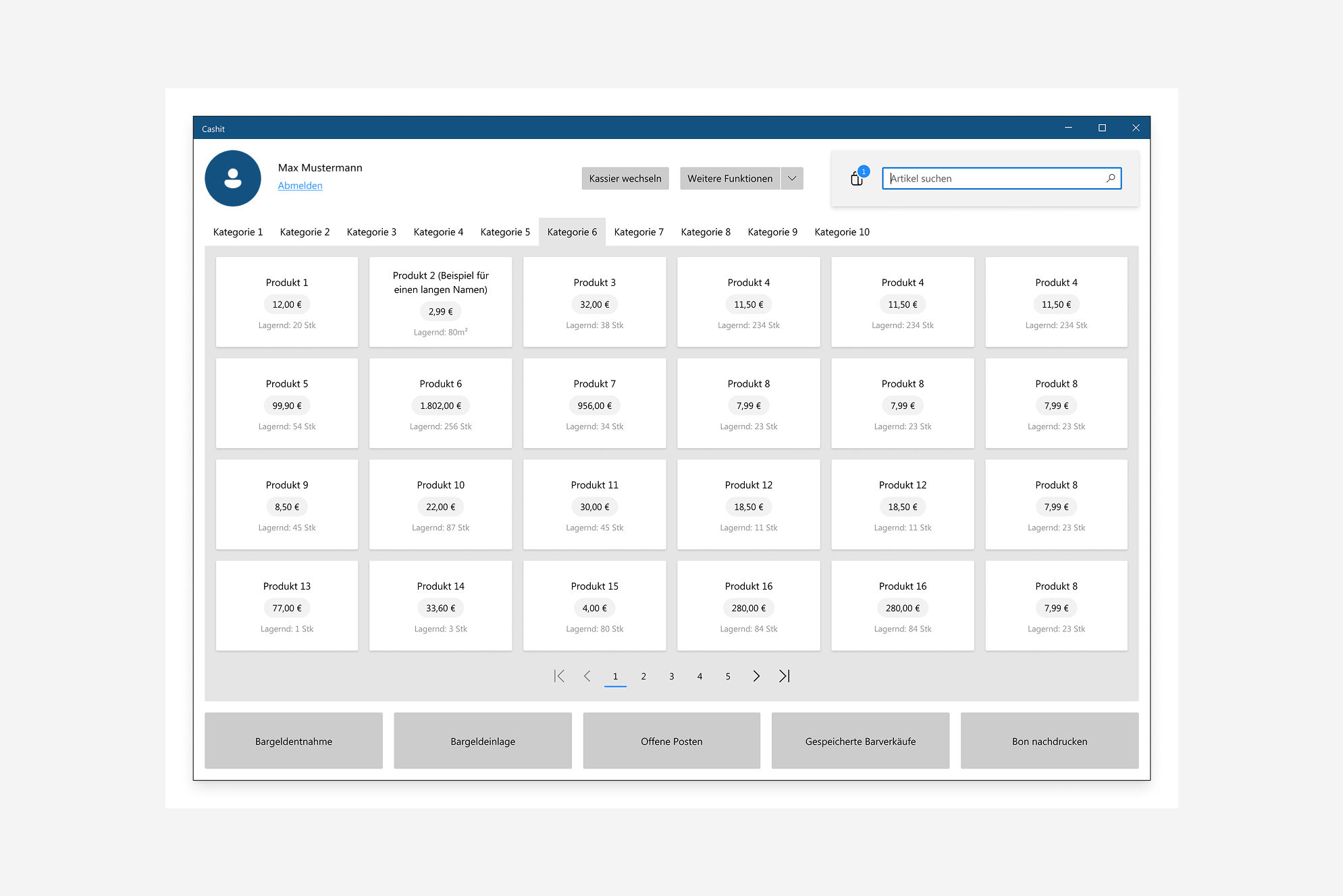
A key focus was the visualization of products. Essential information, such as the product name, price, and stock availability, needed to be clearly displayed. Products with available images were also intended to feature visual previews. In addition, different grid layouts were explored to present products and their variants effectively. Products were also organized into categories to make navigation easier.
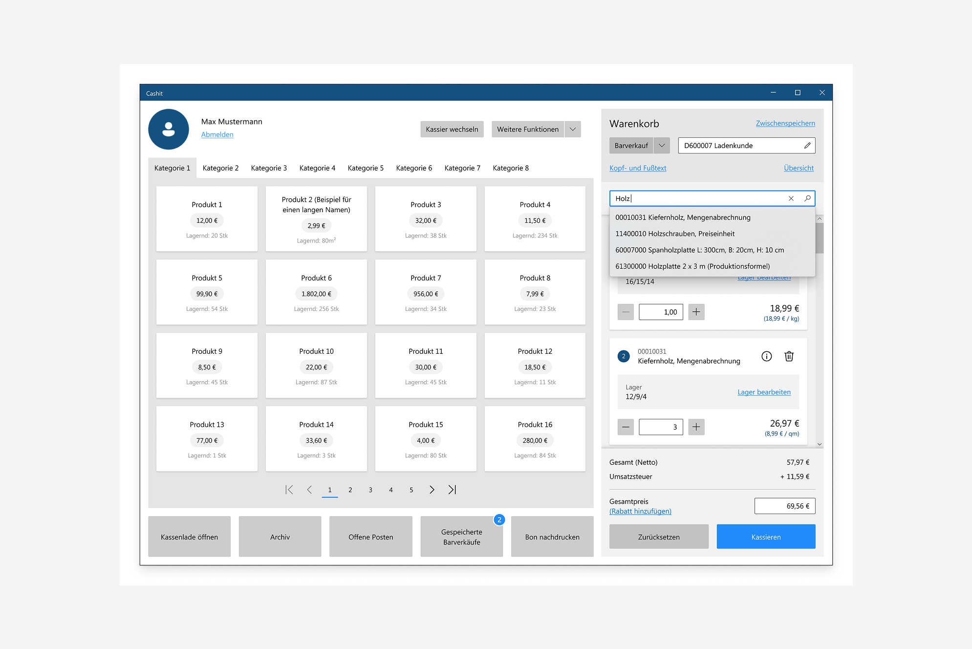
Quick Product Search/strong>
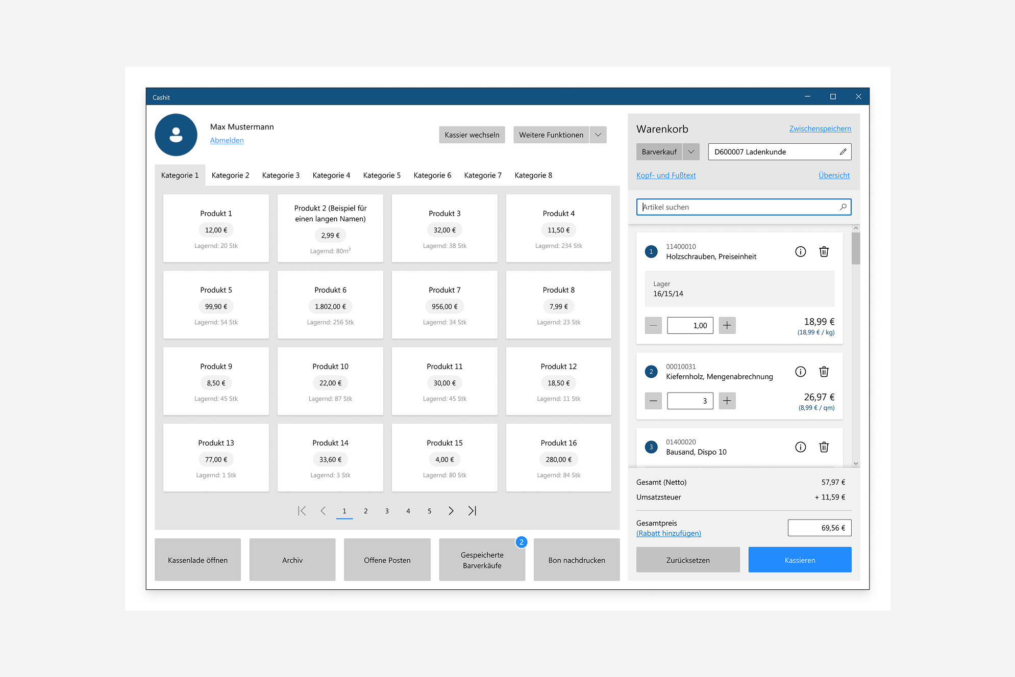
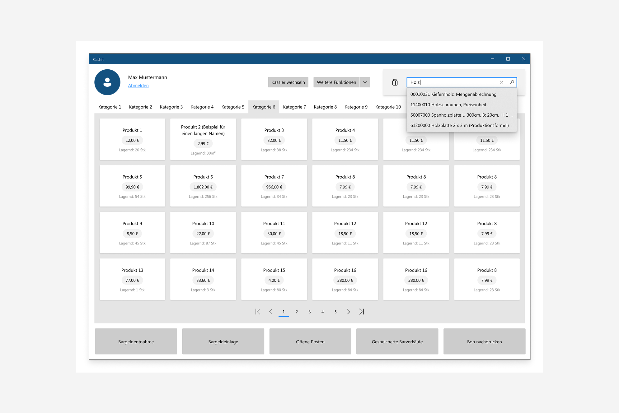
This feature was particularly relevant for power users who already knew the ID or name of the product they were looking for. Instead of navigating through categories, they could quickly find the desired items and add them directly to the cart, making the checkout process faster and more efficient.
Context Menus
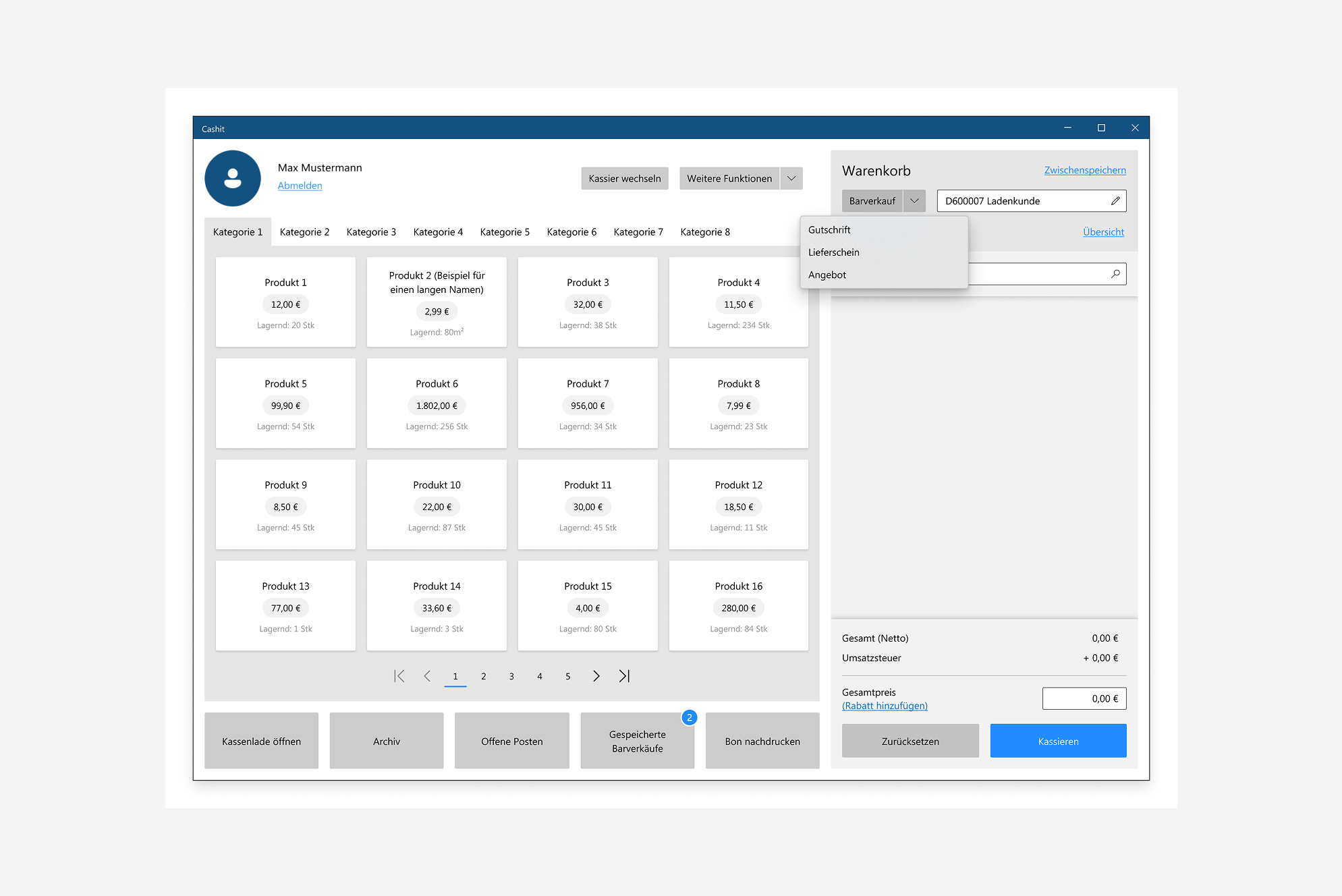
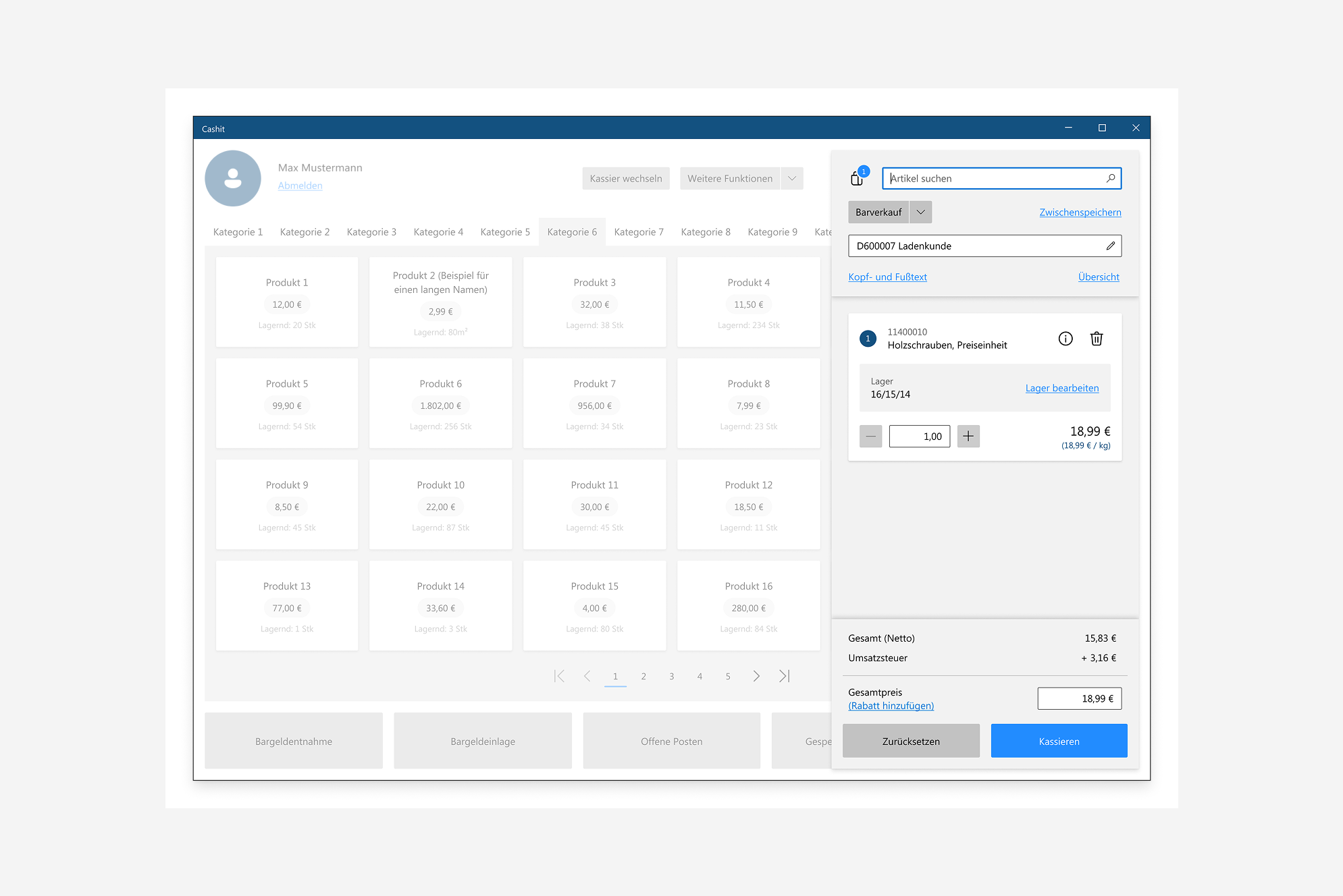
Several key functions needed to be easily accessible within the interface. In this example, users could switch between cash sales and other available sales types, allowing them to adapt the workflow to different transaction scenarios.
Payment and Checkout Process
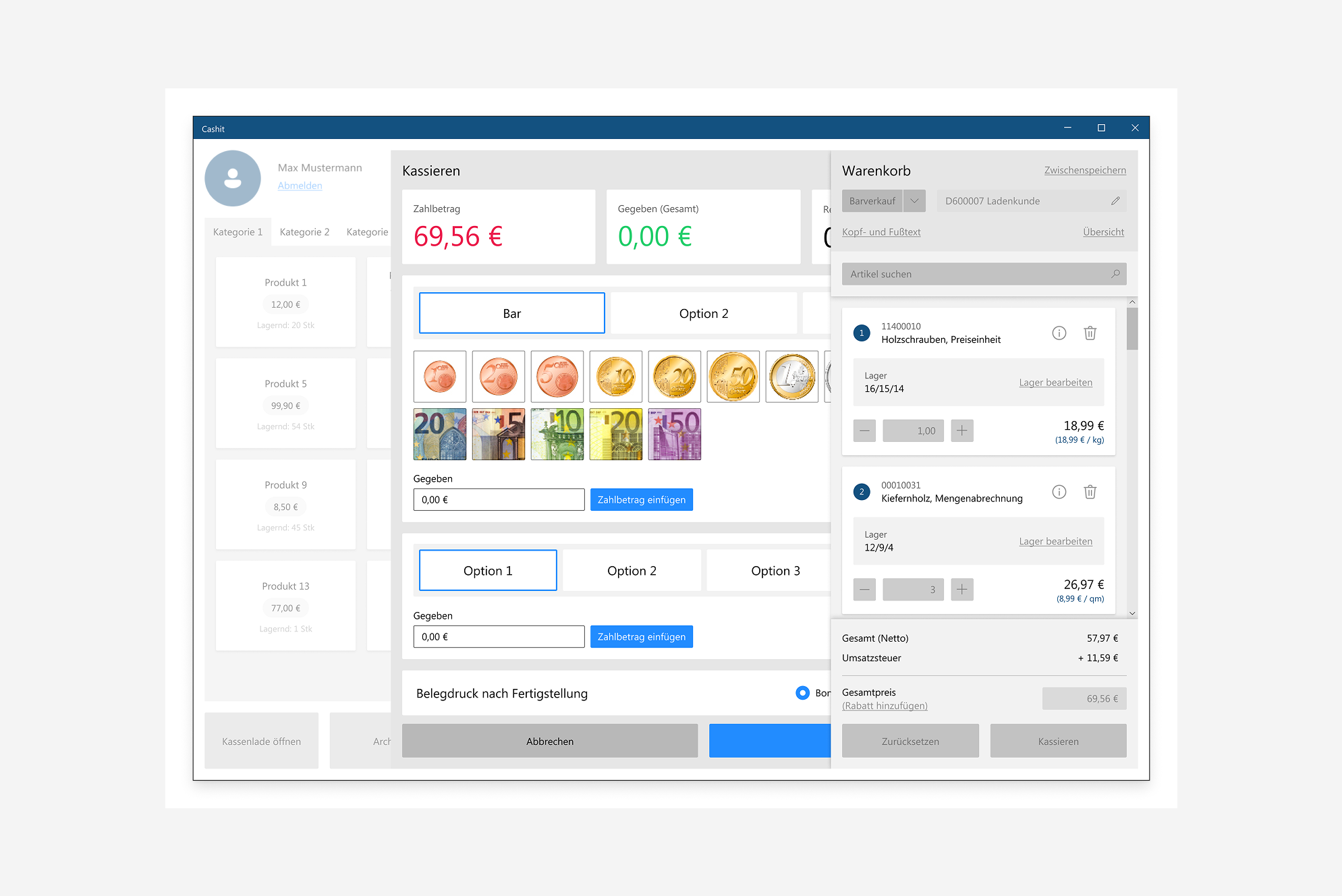
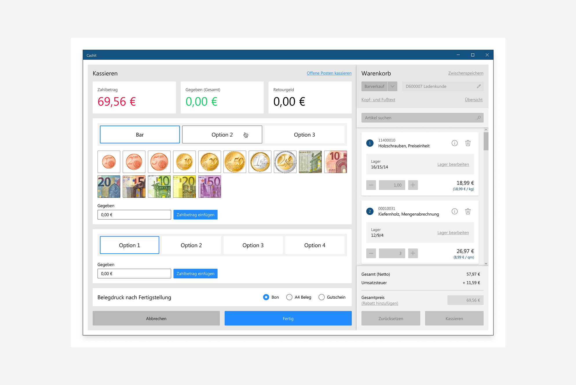
Once the cashier had added all the customer’s items to the cart and initiated the checkout process, a payment panel would slide in from the side. This panel provided a clear overview of the outstanding amount and allowed the cashier to change the payment method.
Cashiers could select specific coins or banknotes or manually enter the amount received from the customer. Additional options, such as receipt settings, were also available. Throughout the process, the shopping cart remained visible, enabling the cashier to review the selected items and verify that everything was correct before completing the transaction.
Alternative Cart Concept
Another concept explored a shopping cart similar to those found in online stores. The cart would remain hidden until opened by the user, maximizing the available space for product selection.
This was an initial concept that would have required further refinement to address different use cases and workflows. However, the concept was ultimately not pursued, as the client preferred to retain the existing cart behavior.
Do you need a redesign of an application?
☞ Let’s have a talk.